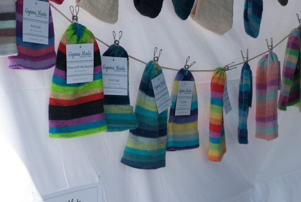
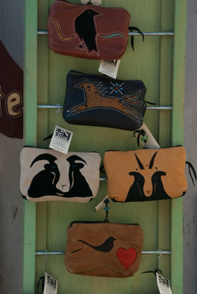
I shared a lot of photos in one of the latest blog posts of my trial and error to get good product photos with consistent backgrounds. I got some suggestions from a few of you and I welcome comments again. I worked on this again today.

I bought a roll of sturdy Manila paper. Do you know why it’s called Manila? I looked it up. Merriam-Webster: “a strong and durable paper of a brownish or buff color and smooth finish made originally from Manila hemp”. Wikipedia: “Manila paper was originally made out of old Manila hemp ropes which were extensively used on ships, having replaced true hemp. The ropes were made from abaca or Musa textilis, which is grown in the Phillipines; hence the association with Manila, its capital city. Abacá is an exceptionally strong fibre, nowadays used for special papers like tea bag tissue. It is also very expensive, being several times more expensive than woodpulp, hence the change to that fiber for what is still called Manilla—usually with two L’s. More recently new woodpulp has often been replaced with a high proportion of recycled fibers. True Manila hemp folders would have been much tougher and longer lasting than modern folders.” See what you learn by reading this blog?
I also have a piece of linen that is a nice color with an interesting texture. I thought I’d try both of those as background. The linen fabric is too small, but I can get more if it works. I just made a curtain for my office and that’s why I still have a piece here.
So I experimented with my phone and my camera with these different backgrounds. My goal is to take photos that don’t need much editing to make the products look like they do in real life.

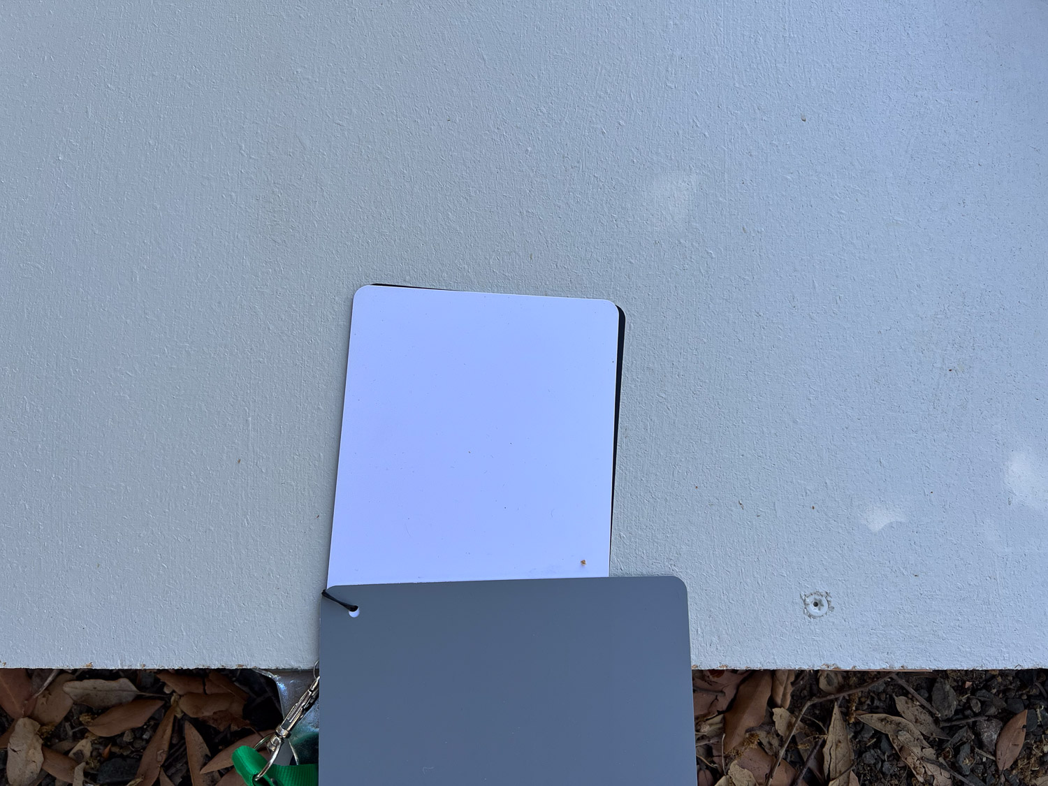
This is the linen on top of the manila taken with my camera. I am not sure if the yellow/rose cast of the manila comes through the linen. Also, light is so important. I took all photos in the shade, but not all shade is the same. The place where I’m hanging the roll of paper is a different shade than if I drag the table over to the middle of the deck area and the roll of manila may affect the outcome as well.
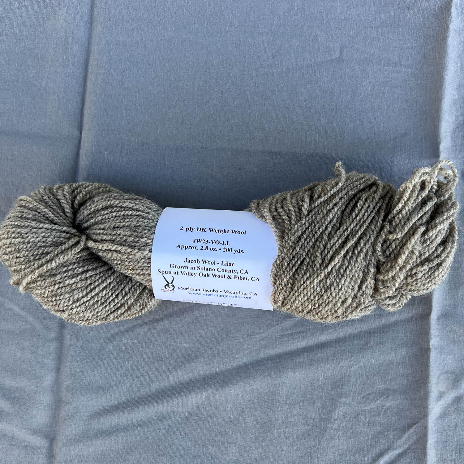
This is that manila paper taken with my phone.

Linen on top of manila taken with phone.
The photos I used here have been minimally edited–mostly to crop to square. This time I shot the photos with my camera on manual and adjusted shutter speed one or two stops. Most of the time the slower shutter speed (more light) gave a better exposure. I don’t think I’m having such an issue with white balance as in the last batch of photos.

Linen on top of manila, taken with Nikon.

The same as above but taken with the phone. Colors are close but not the same.
I moved the table away from the wall so the linen is resting on the table. There will be no influence from the mainla paper underneath or on the wall. This photo is taken with the Nikon.
Same thing, but taken with the phone. I see a blue cast to the background linen.

These photos are also taken on the table, on the linen cloth alone. This one is with the Nikon.

Same thing but with the phone. There is that blue cast again. I could probably adjust that in the phone, but I haven’t done any adjustments on these photos other than exposure on some of the Nikon ones.

Same place, table with linen cloth, taken with Nikon.

Same photo taken with phone.

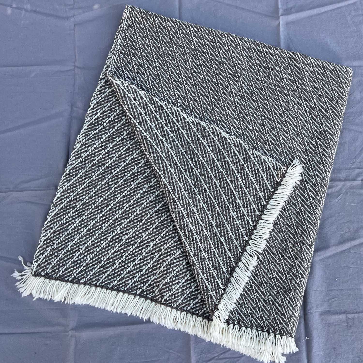
I moved the table back to the position with the manila paper. So this is linen cloth on the paper, taken with the Nikon.

Same thing but taken with phone.

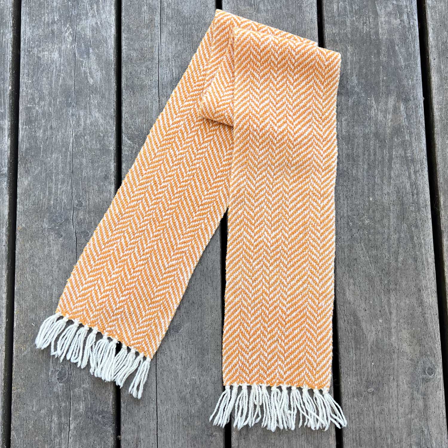
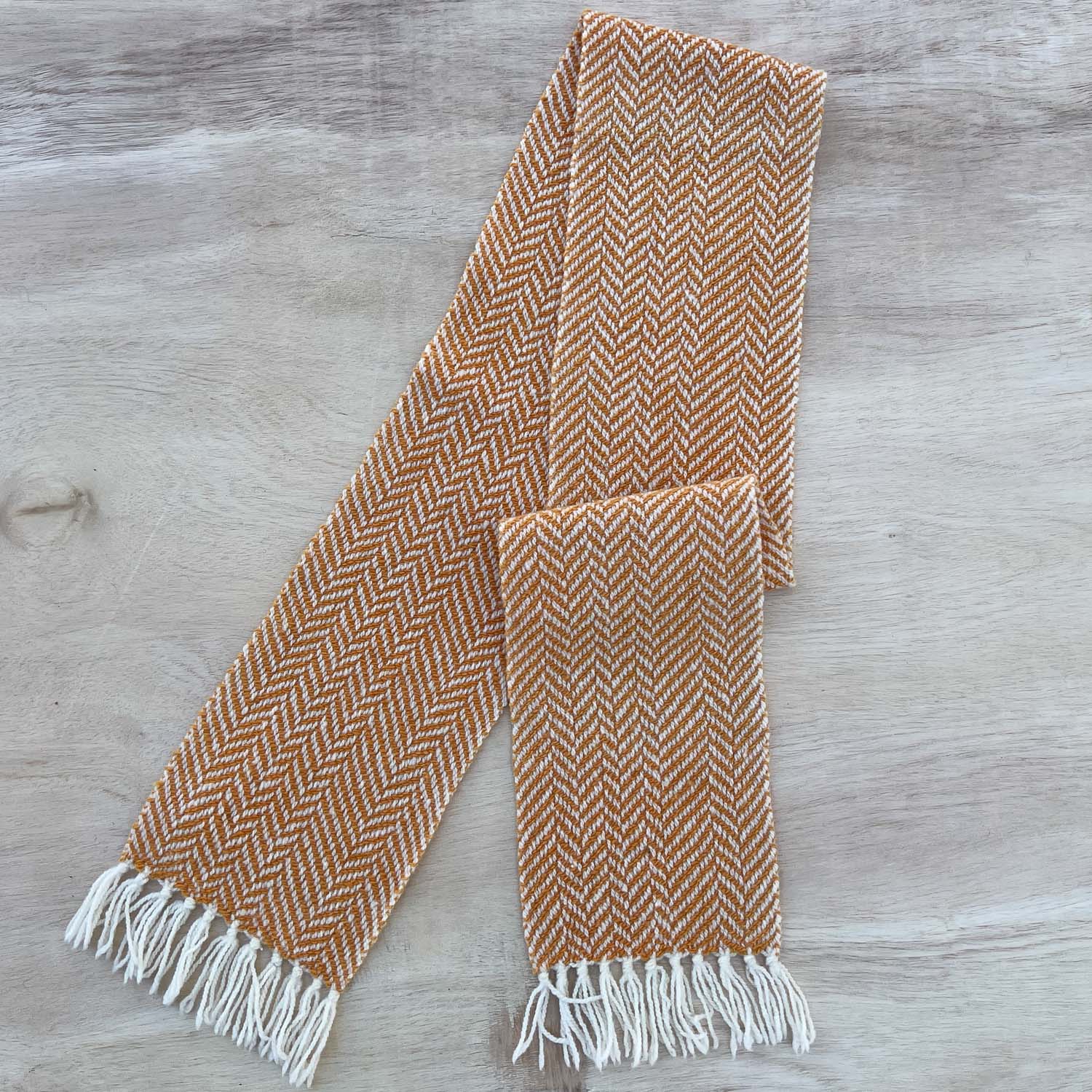
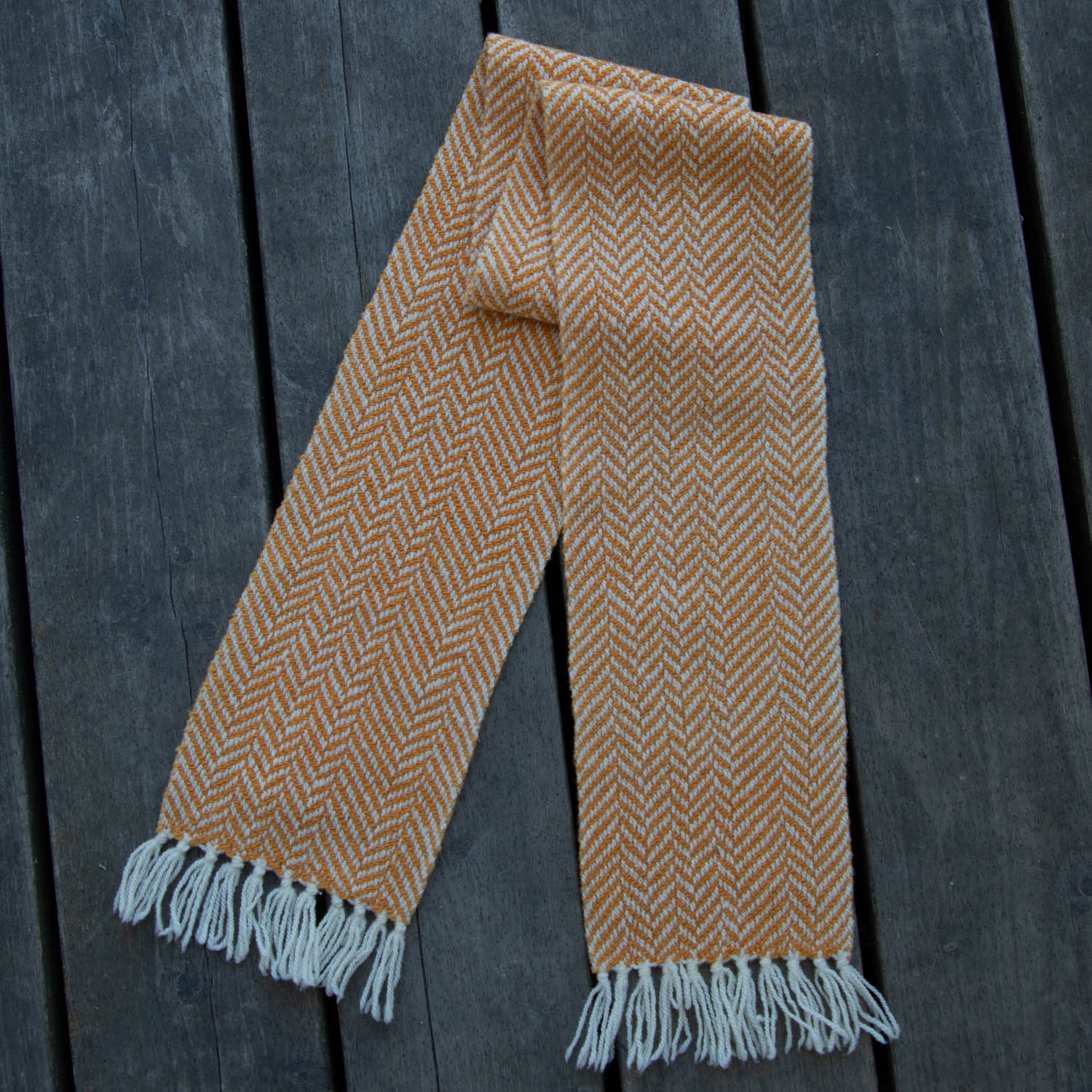
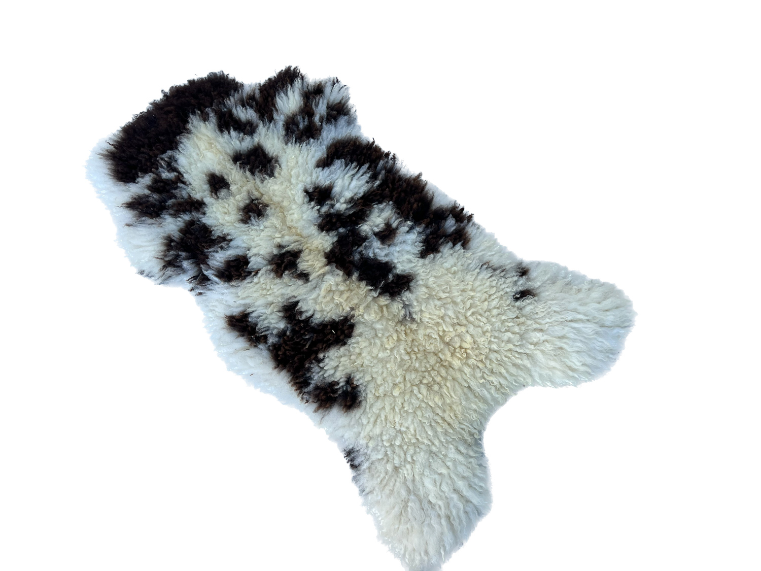
This is the scarf on manila paper alone using the Nikon.
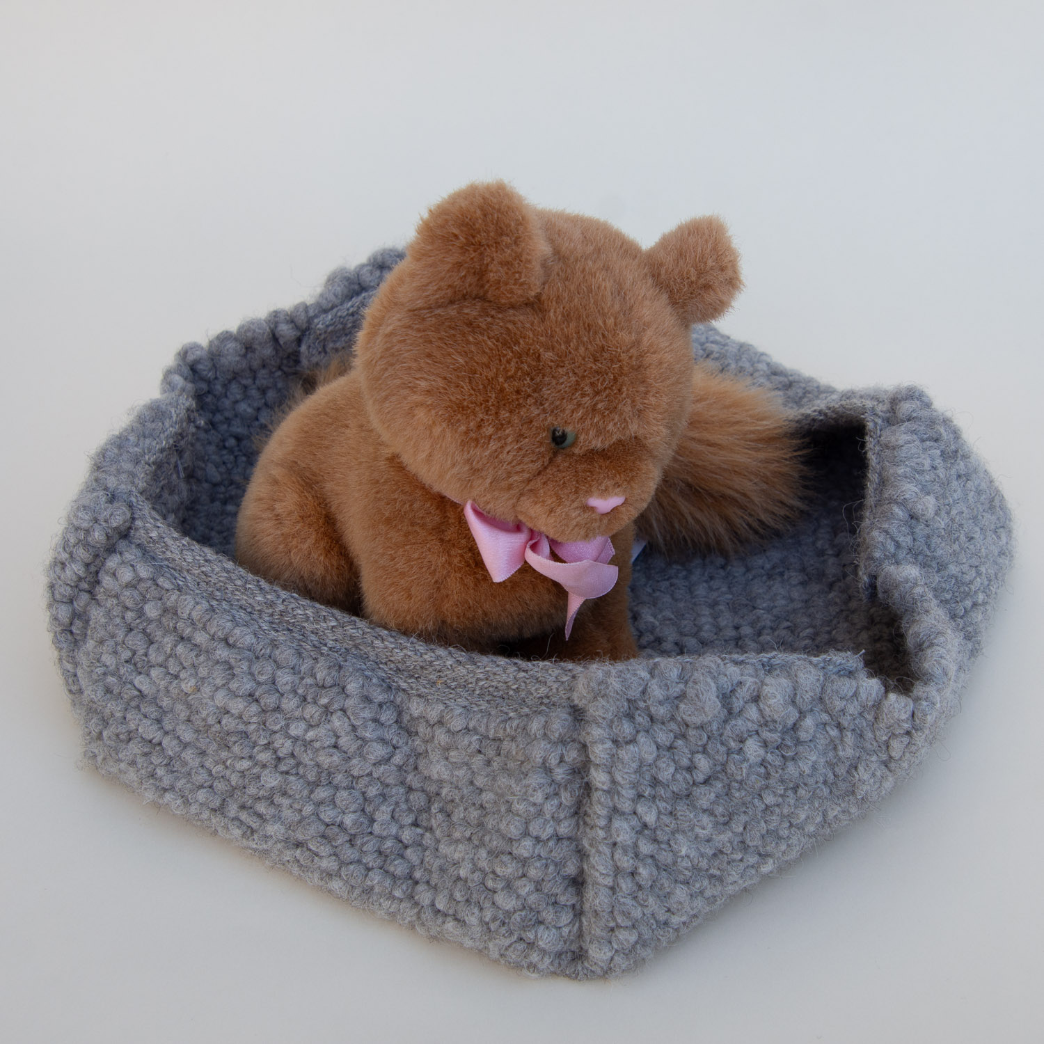
Cat basket on manila paper. Photo taken with Nikon.
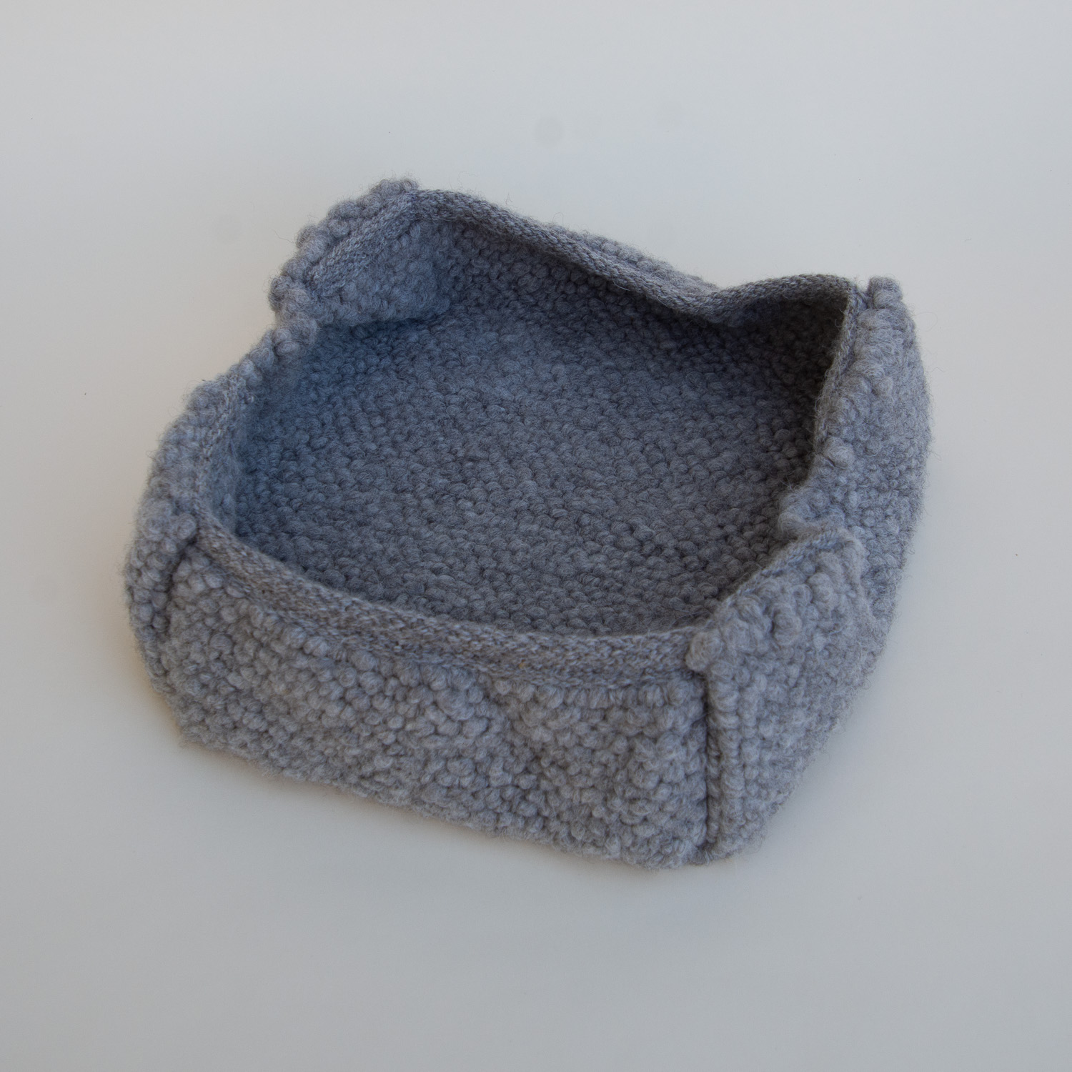
Same thing but no cat.
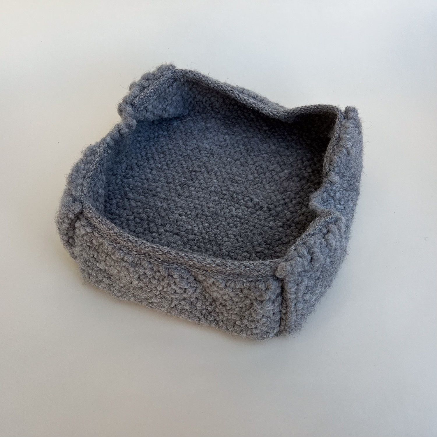
Same thing taken with the phone.

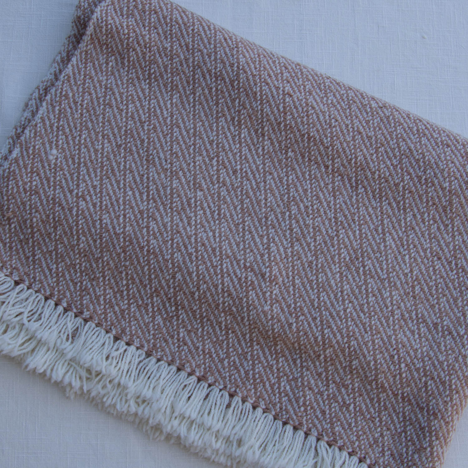
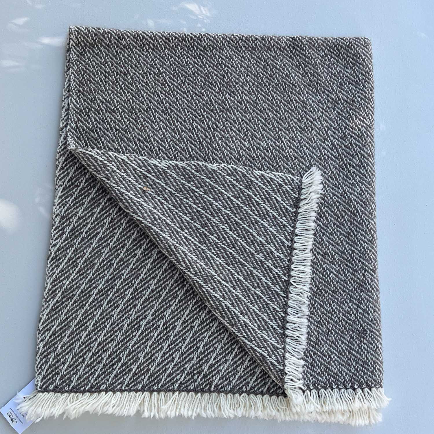
Here is a blanket on manila paper taken with the Nikon. I think this one could benefit from exposure adjustment.
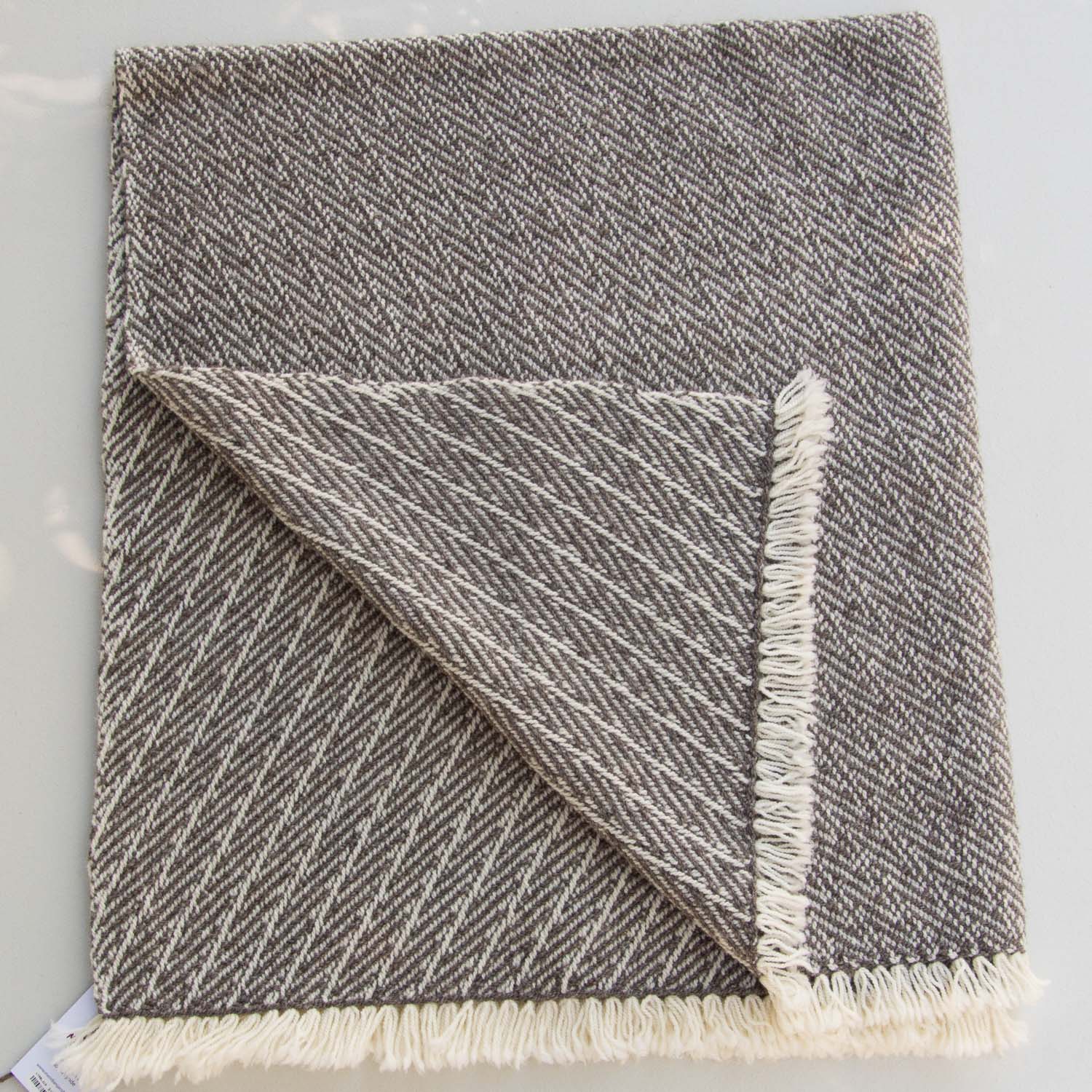
Same photo taken with the camera. Color of the blanket is more natural.
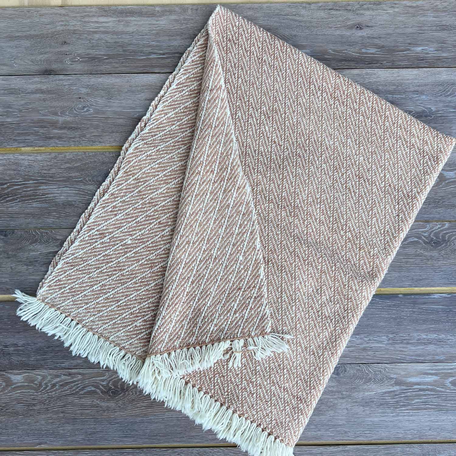
This is in the same place with the linen over the manila. Nikon photo.

Same photo taken with the phone. There is definitely a difference in the color in these photos.

I liked the photos in the last post that were taken with a wood background but I don’t like the spacing between the planks that creates a dark line. We have some leftover flooring that in the house I think of as gray, but I guess they have a brown cast. These planks were left over after we finished the floors and the “groove” edges of “tongue and groove” have been trimmed off. If I want to use these I will trim that edge so there are no big yellow gaps.

I think the colors of the yarn and products are true, but is the background distracting even if the gaps are gone?
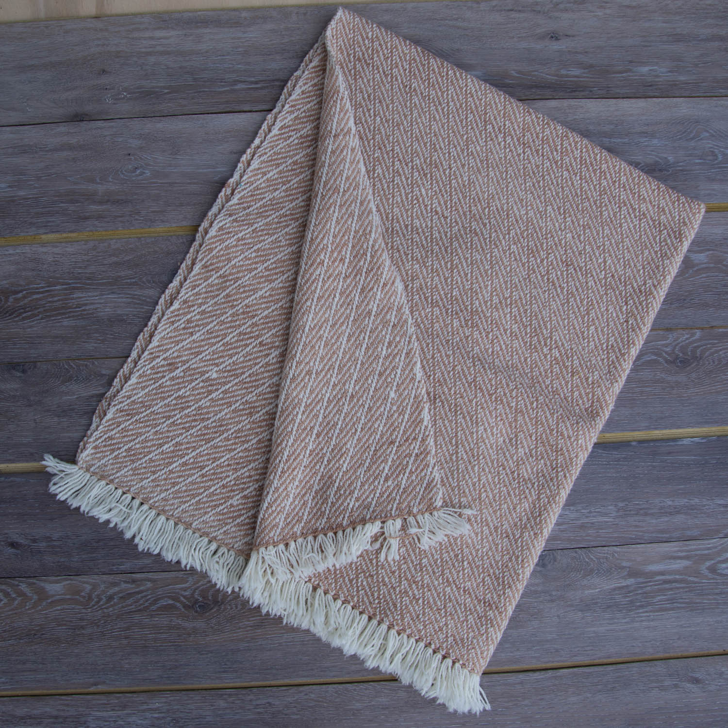
UhOh. Why does the white fringe on the blanket look green? Compare it to the scarf at the bottom. In this last series of photos I didn’t compare Nikon to phone photos, and they are all phone photos. I just added the Nikon photo of the blanket below.

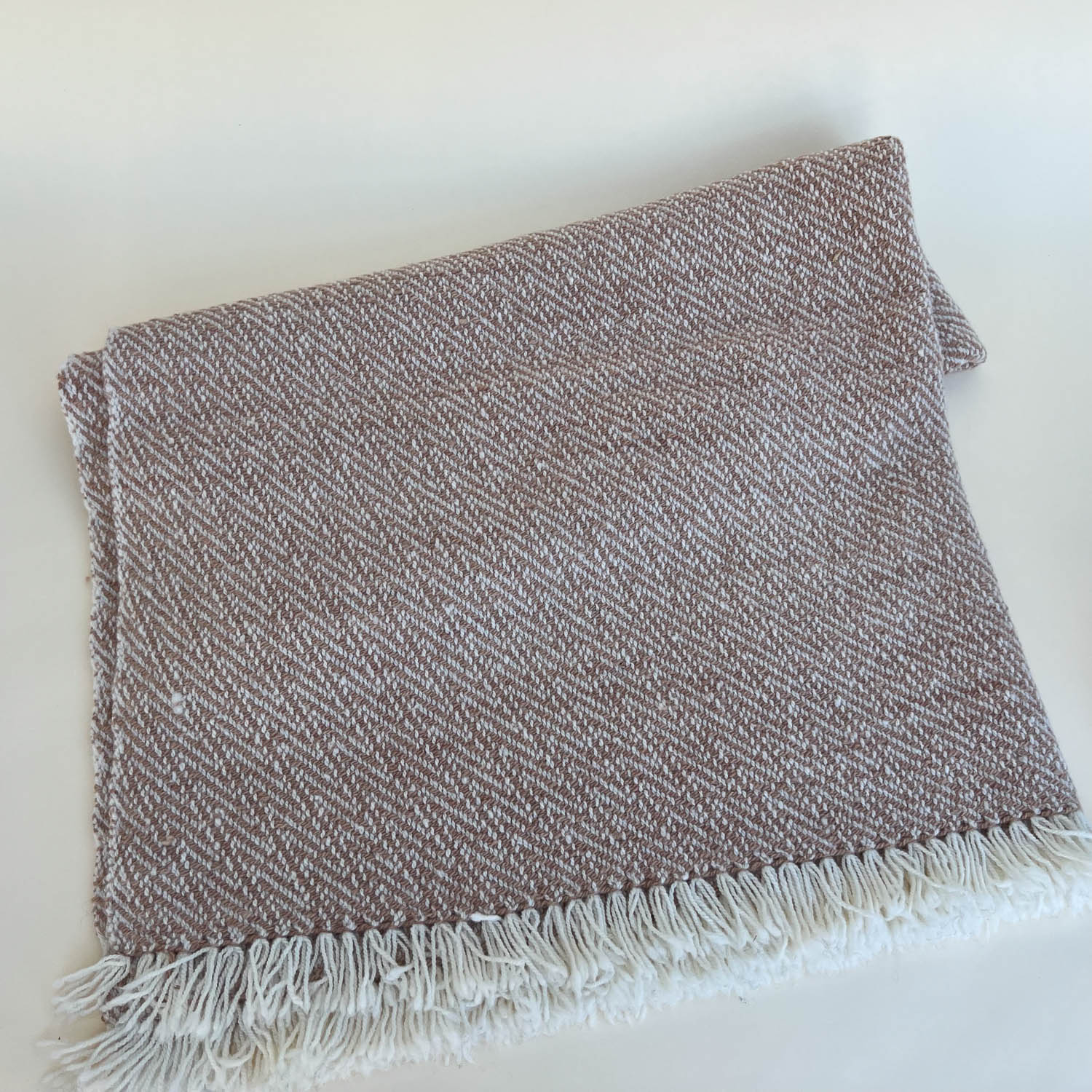
Scarf using phone.
There is a lot to figure out. Tomorrow.


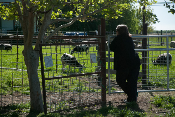
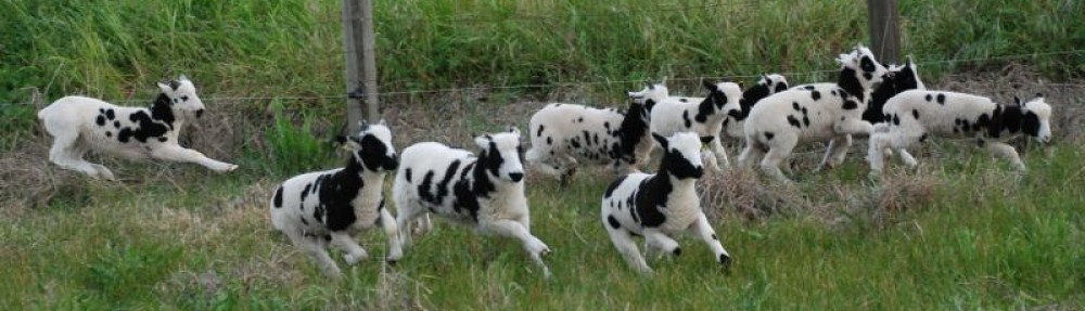
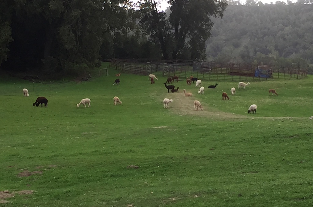 When I asked how many alpacas there are, Mary said between 150 and 200. They roam the hills on the ranch, accompanied by guardian dogs.
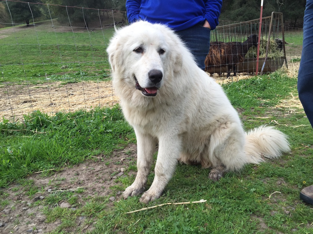 This is one of the many ranch dogs that include guardian and herding dogs. We were told that this one is only 8 months old.
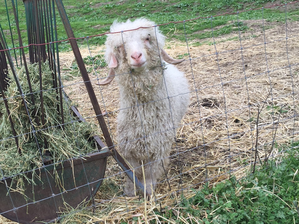 Our meeting was in the greenhouse located near the field where the bucks live.
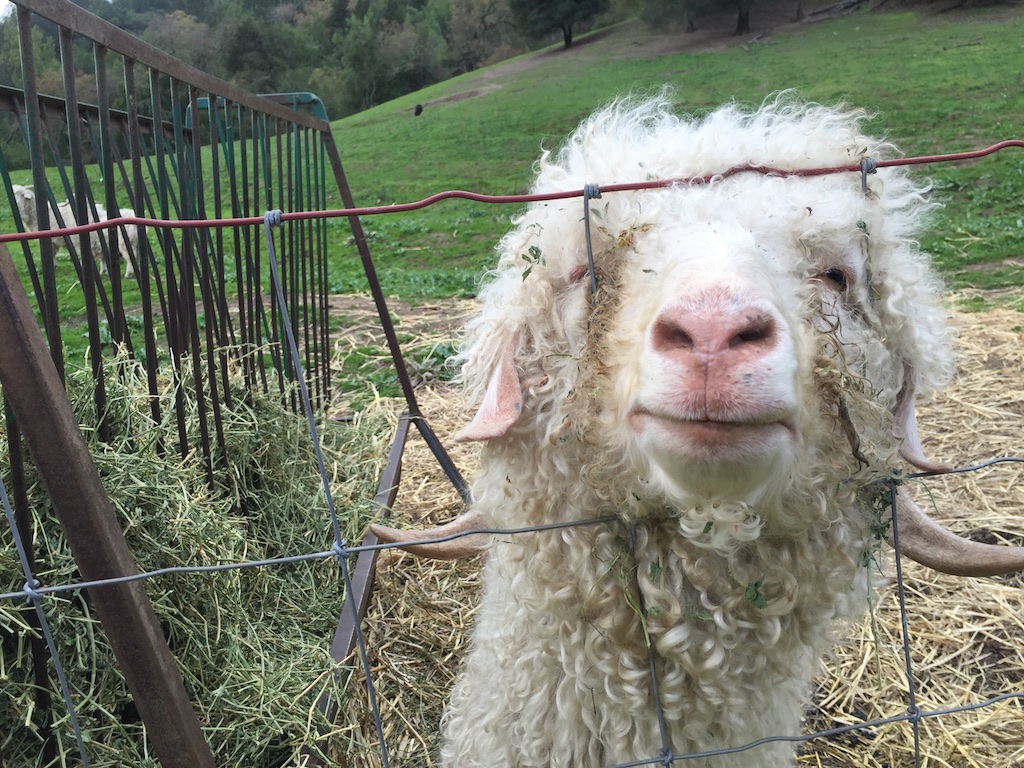 This guy seemed pretty friendly.
 Before we started the meeting we admired each others fiber products. This is one of the Twirl yarns produced by Mary.
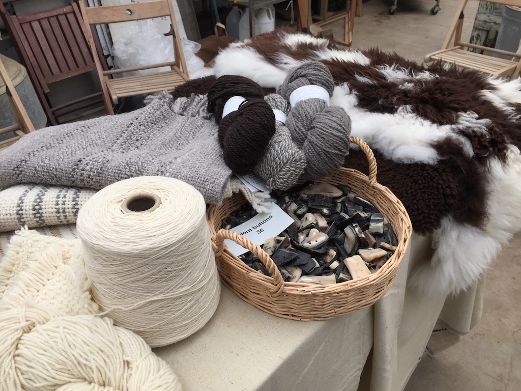 This is what I brought to share–sheepskins, buttons, yarn, and shawls from my Jacob sheep. The new
 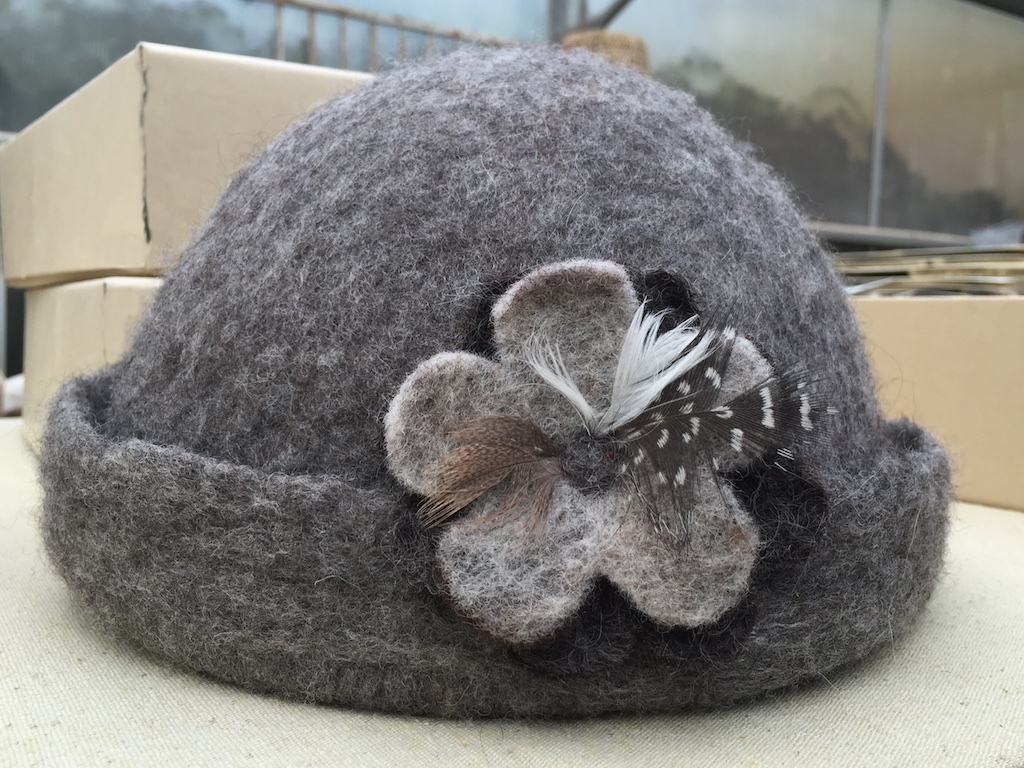 This is a felted hat made by
  Here is
  …and this is a piece she felted from the wool of Vicki, one of my Jacob sheep.
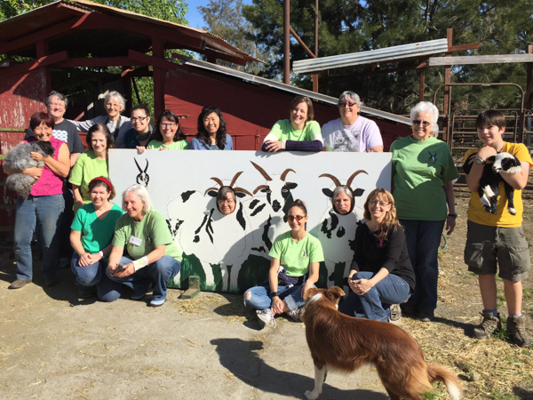
 We were able to see the recently produced Wool and Fine Fiber Book. Each producer has a spread in which samples of their fiber is attached. These books will be circulated to designers and manufacturers who want to find out what kinds of fiber are available locally, how to contact the producers, and to learn how these fibers might be used in end products. This was an amazing undertaking by Fibershed.
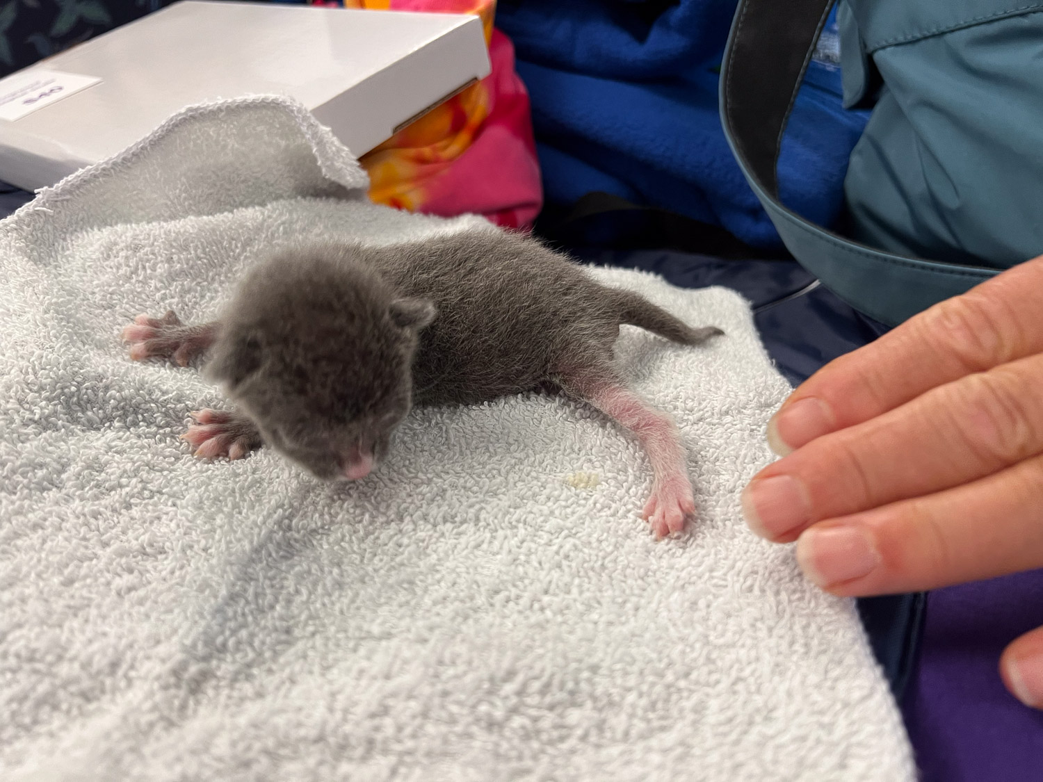
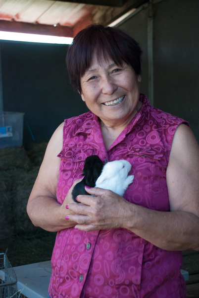
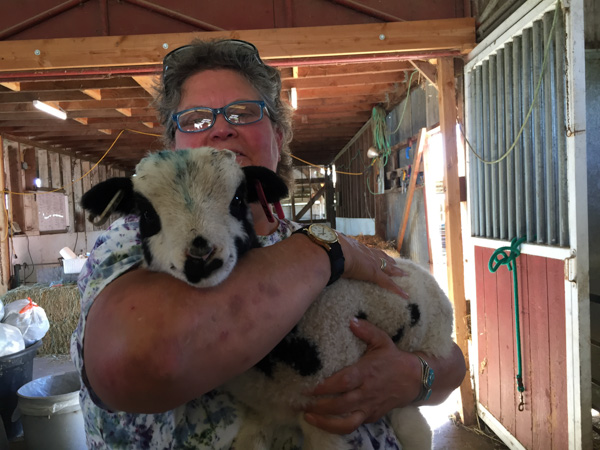
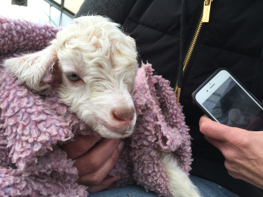 While hearing about all this we were also doing what Fibershed producers do best, eating and baby animal snuggling. This is a two-day old kid who needs some TLC.
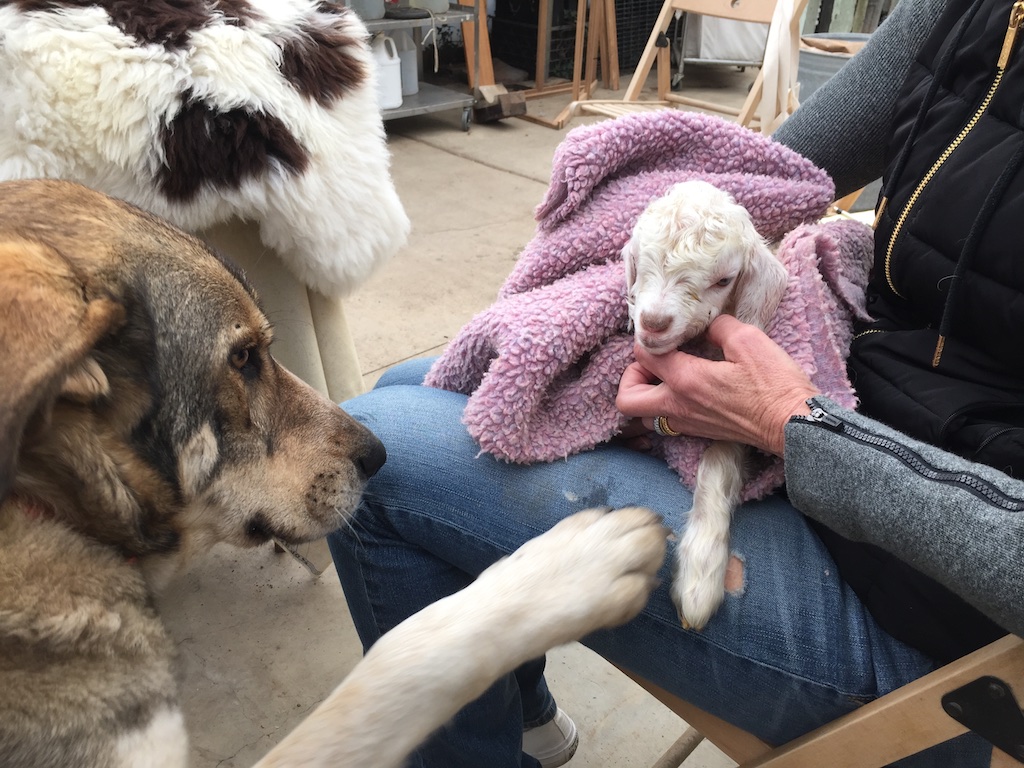 One of the dogs was feeling left out.
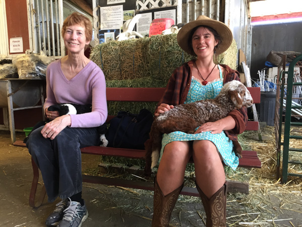
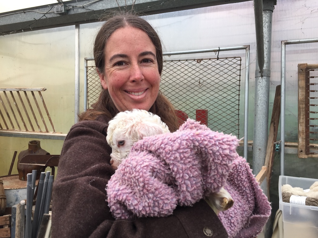 Even Rebecca found some goat snuggling time.