As you know I like to take photos. I think that most of them (at least the ones I share) are decent. I know the basics of photography and am familiar with the importance of exposure, focal length, white balance, etc. But its one think to know ABOUT the concepts. It’s another to put them into practice.
When you base most of your business on online sales, obviously the photos are very important. I really need to update all the products on my website and there is soon to be a launch of a new website with some of my pieces. I NEED to have decent photos.
I am writing this post as a tool to analyze what I’m doing and share the info with some people who might have advice. Comments are welcome.
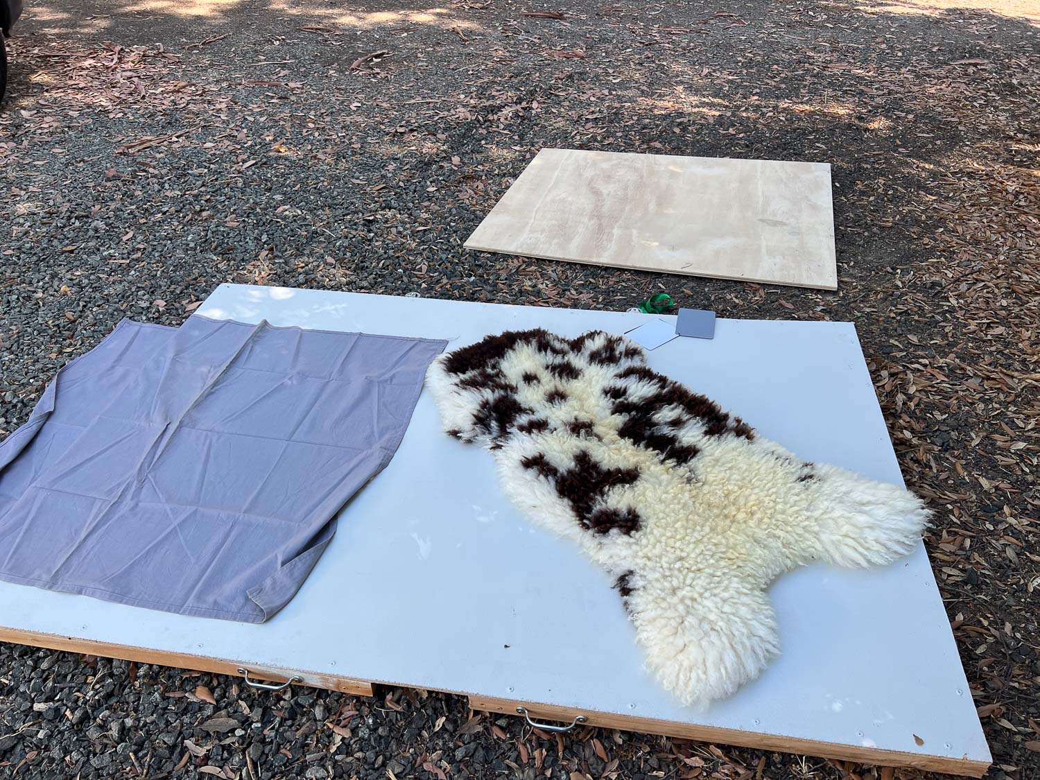
I have used that white (but not really white) board for a couple of years. Dan put wheels on the edge so I could store it upright and roll it around to where I need it. It is cut the dimension to match the photos when I use my Nikon. That was very helpful since the template for my current website uses horizontal photos for the product pages. However I have had to provide square photos for other websites and that is what the new one will use. So I have to keep that in mind when I’m photographing products. The request for the new website is that all the main product photos have a consistent look as far as color. White? Gray? Wood? Purple??? I have to choose one. I have to choose one that will help me take good photos.
The part I struggle with is white balance. That means that the backgrounds look like what I’m seeing in real life and the products are represented properly. I am not going to try and include all the photos I took here. I tried four backgrounds with each product–the white (not quite white) board, a gray piece of fabric to decide if I want to paint something gray, a piece of raw plywood, and the deck in front of my shop. I took photos of each product on each background with my Nikon and with the iPhone. I am disappointed that I have a harder time getting the color right, at least on the white background, with my real camera. Most of these are with the iPhone. My goal is to take photos that are correct and not have to spend time with post-processing on the computer.
It would be simpler if I could put all these photos side-by-side or at least in a block of four, but I can’t make that work. Besides maybe when you look on a phone that would make it more difficult.
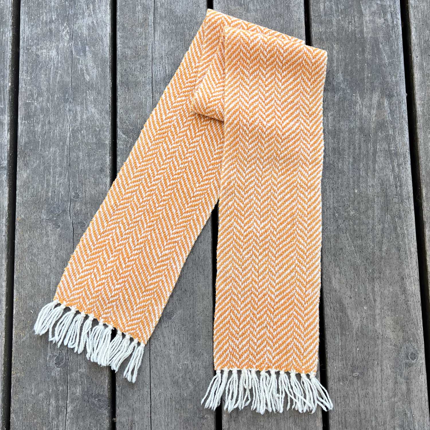
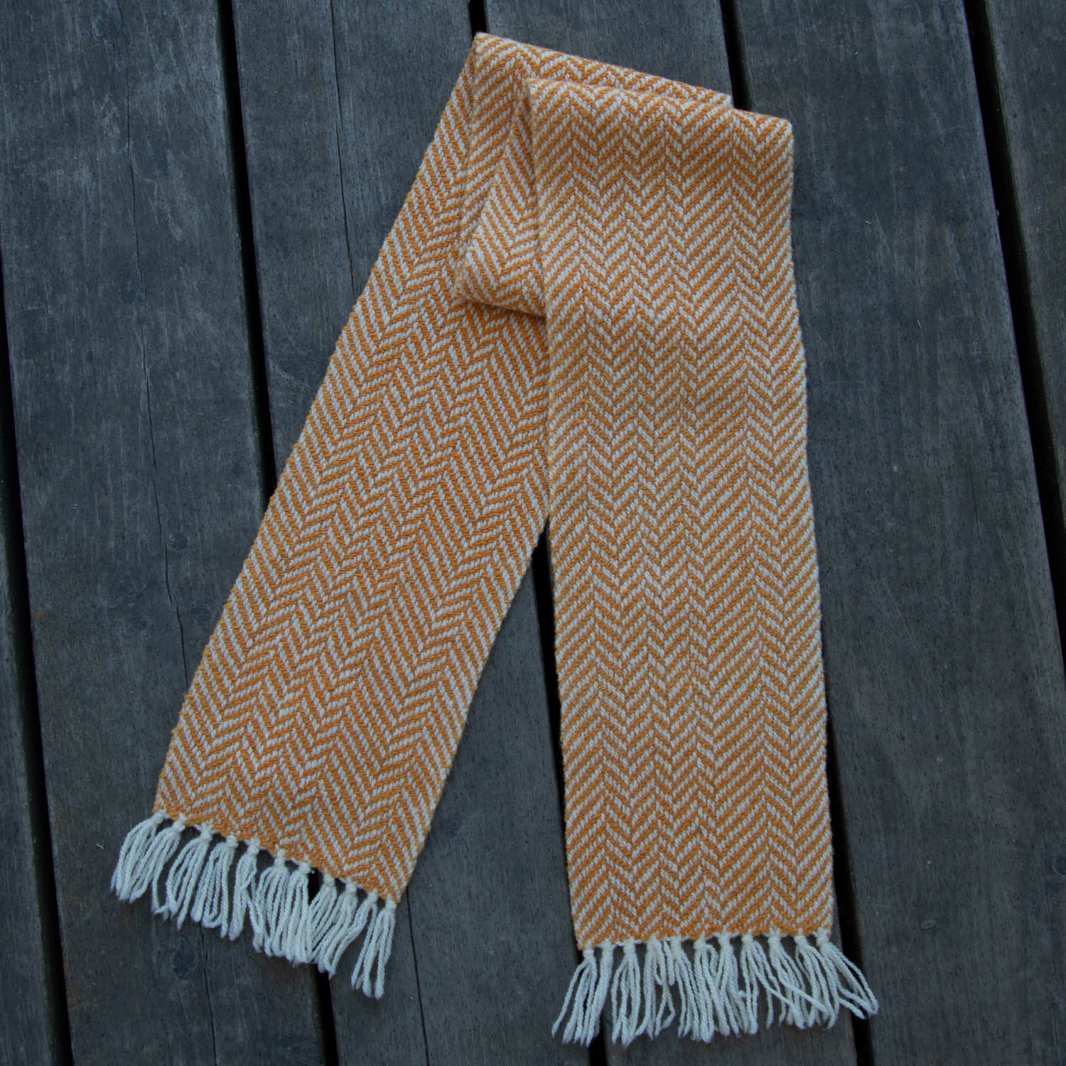
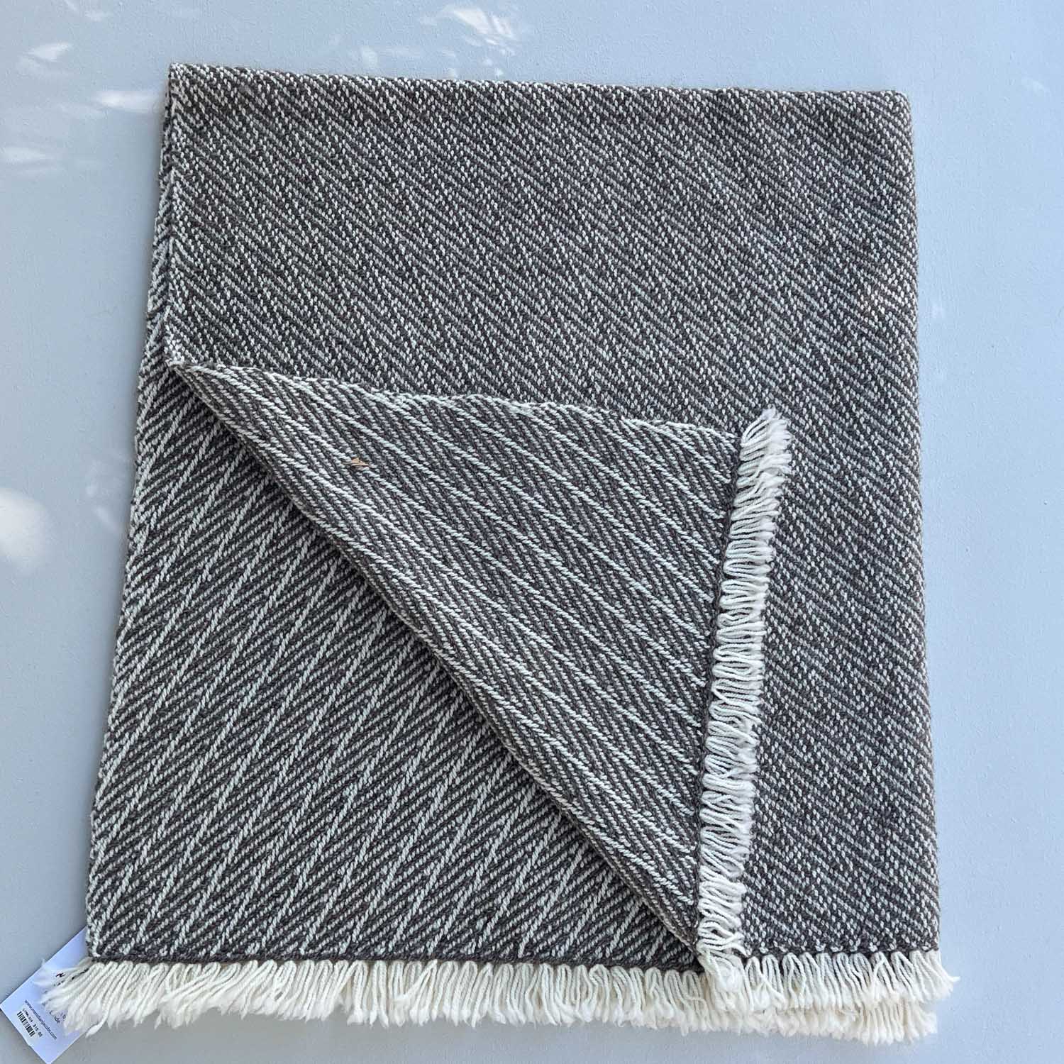
This herringbone scarf looks most natural on the wood of my deck. At least the color I see on my computer looks like the scarf. The background isn’t a good choice for smaller projects however. It’t the spaces between the boards that are the problem.

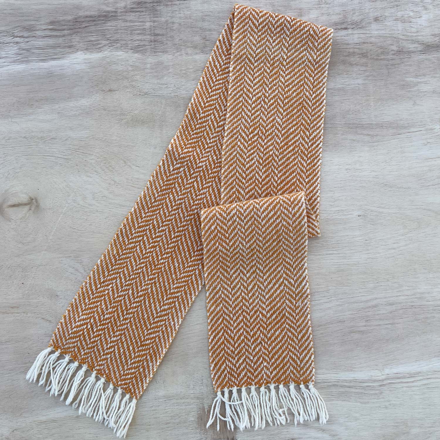
My so-called white background. The whole thing looks dingy and the scarf is not the true color.

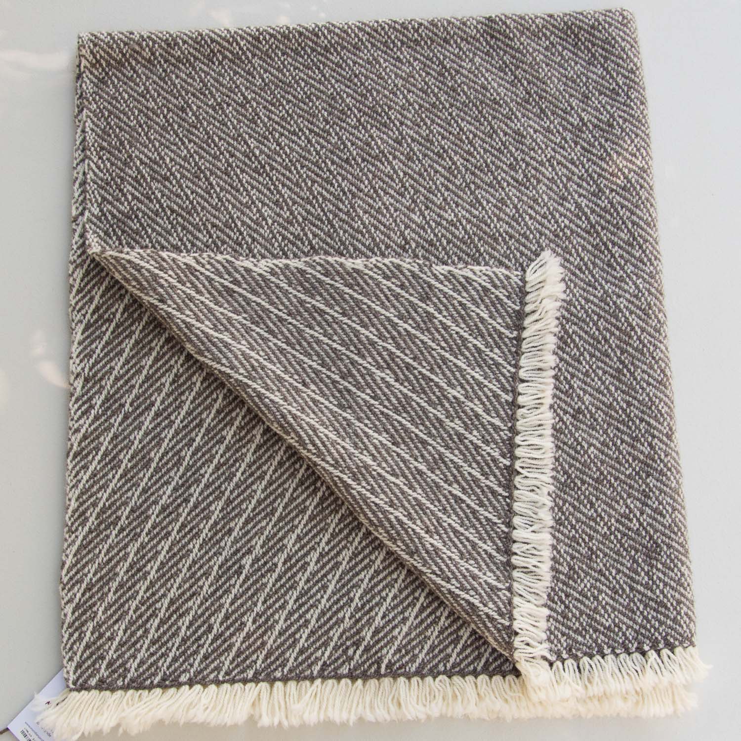
The color of the scarf is better here, but that gray looks darker than it should and there is a blue cast. (I know its wrinkled–it is a stand-in for a painted board.)
The color of the scarf on the natural light plywood is wrong.
The next two photos are taken with the Nikon.
This is without editing. The exposure is too dark. I lightened it on my computer and it was OK.

I lightened the exposure and shifted the white balance in the computer on this one, also taken with the Nikon.
Light gray yarn on the wood deck. The lines are definitely distracting as are the speckles that weren’t as noticeable in the photo that wasn’t as close.
Even without the wrinkled cloth, this color doesn’t do much for me as a background.

It bothers me that the background looks dingy here. This is the same skein of yarn in all four photos. It sure looks darker here than in the first one, which is more correct.

The yarn color looks even darker here. I thought about having several skeins of yarn in one photo–I think that would help with the color. However, it has to be really clear that a purchase is for only one skein of yarn, unless the customer chooses more.

This is the iPhone photo from above with exposure adjusted in Lightroom.

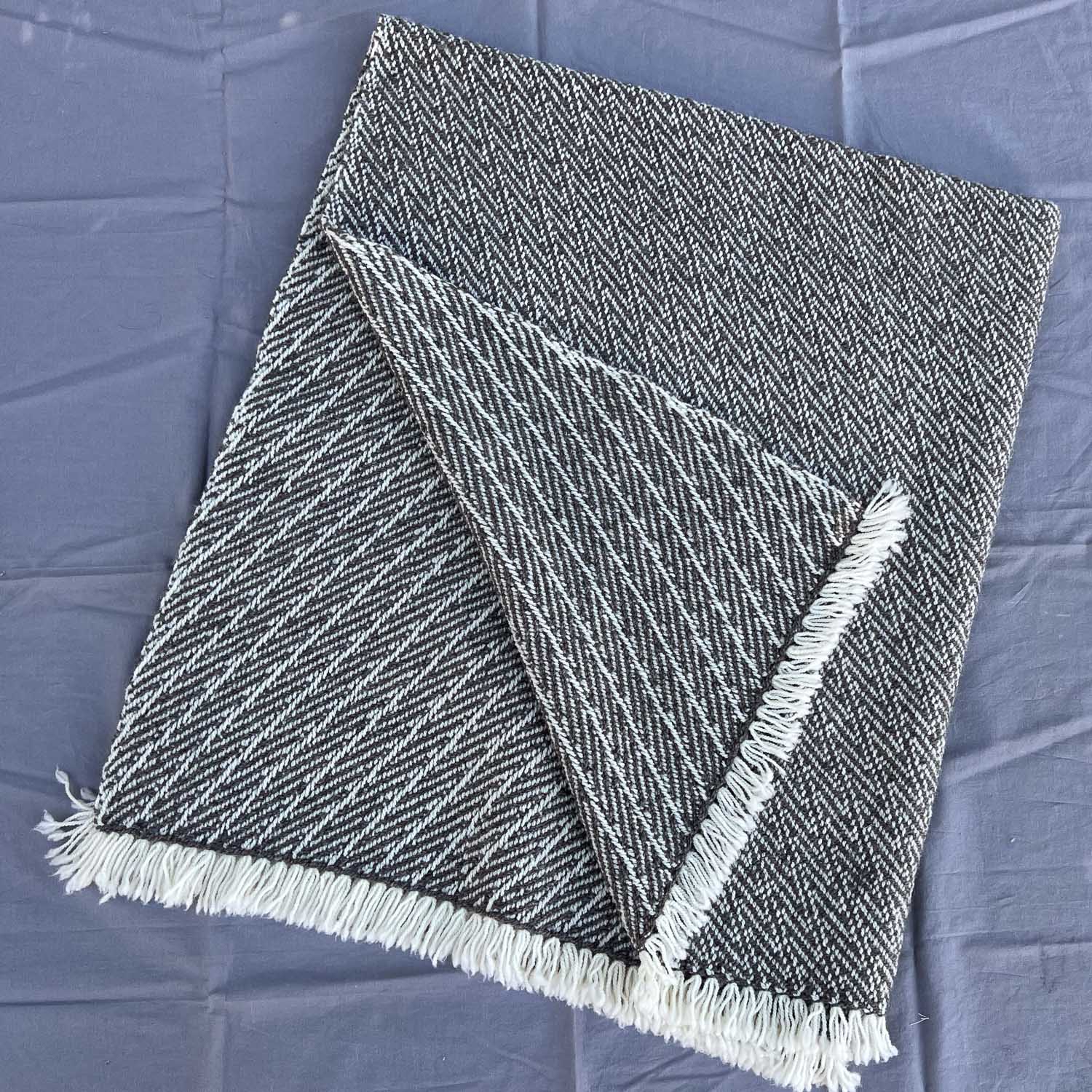
I think the color of the blanket is the best on the wood background.
The color is a little darker here and the gray fabric is darker.

The blanket looks more black white or at least dark gray than it really is.
Here is that “white” background. The blanket still looks darker and the background has a blue cast.
This was taken with the camera. The exposure was wrong and the background looked dark gray. I lightened it and shifted the color temp from the blue side to the yellow side. But now this looks browner. The colors of the first photo in this series look more true, at least on my screen.
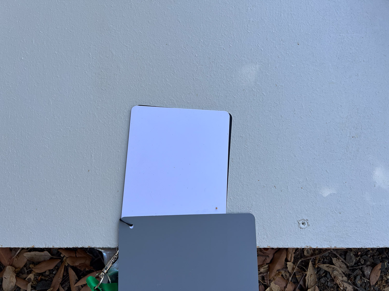
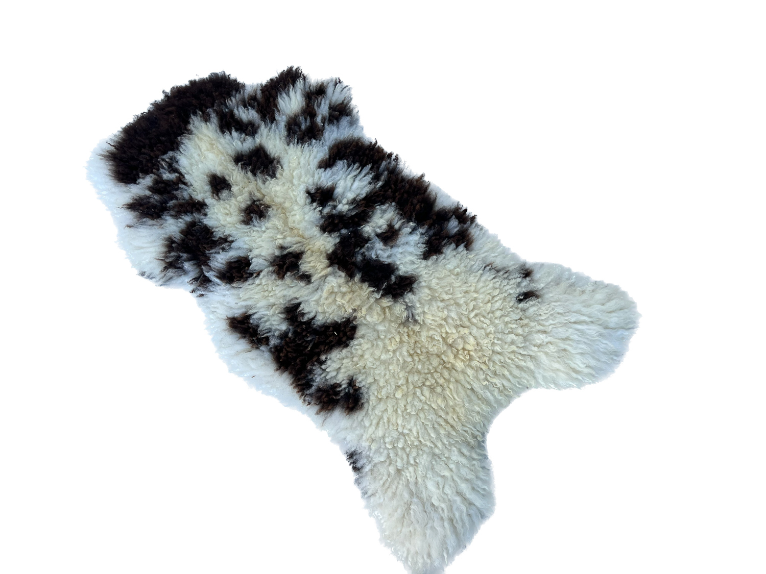
I have this set of grayscale cards, but just because I have it doesn’t mean that I can use it properly. That white one is true white, but I don’t think it looks true white in this photo. It does show how far off the board is. Some of that may be the photo though. If you look at the very first photo with the sheepskin you can see this set of cards on the board and it looks different there.

While mulling this over I saw my white truck right there. That is the truest white so far. This photo was taken in the sun and all the others were in shade.
So where does this leave me? I think that I should be able to use a white background but I’ve never felt successful with that. I think it’s easier to get true color on the wood deck. Is that because the camera is sensing more variety of color and contrast than when you use just a solid color? What if I stained a piece of plywood to have it lighter than the deck, but with some variation from grain?
Last night I experimented with ways to remove background from iPhone photos. I used one for which I didn’t have to use an app. Some look OK but it’s not foolproof.


The edges don’t look right here.

Definitely a problem here. It couldn’t distinguish the fringe yarns. I think that dark line is from the deck space.
As I type this my screen lags behind the keyboard. In addition to the photo issues my computer is full. Now what? I thought using iCloud would help but I don’t understand enough to set it up properly. As I’ve said before, where’s a millennial when you need one? Or even a 12 year old?
