I saw a blog post the other day in which the writer had recorded everything she wove within that year. That gave me this idea. I’m taking photos and keeping notes all the time. I may as well use them. I won’t try to fit the whole year into one post however. Maybe I’ll post weaving, then I’ll post lambs, then weaving, then lambs. How’s that?
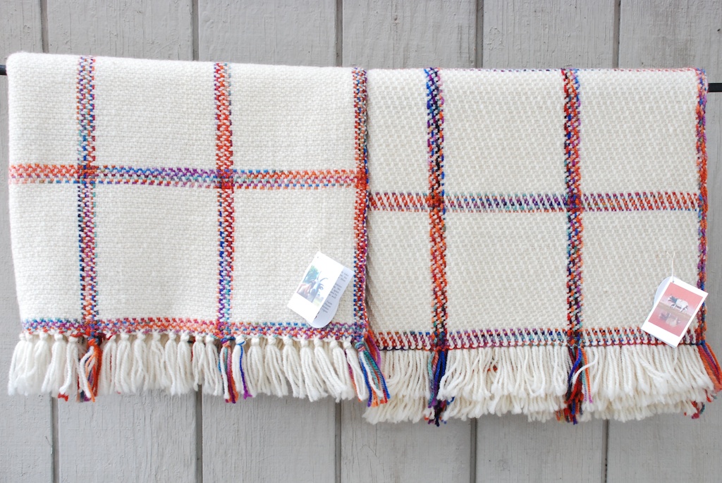
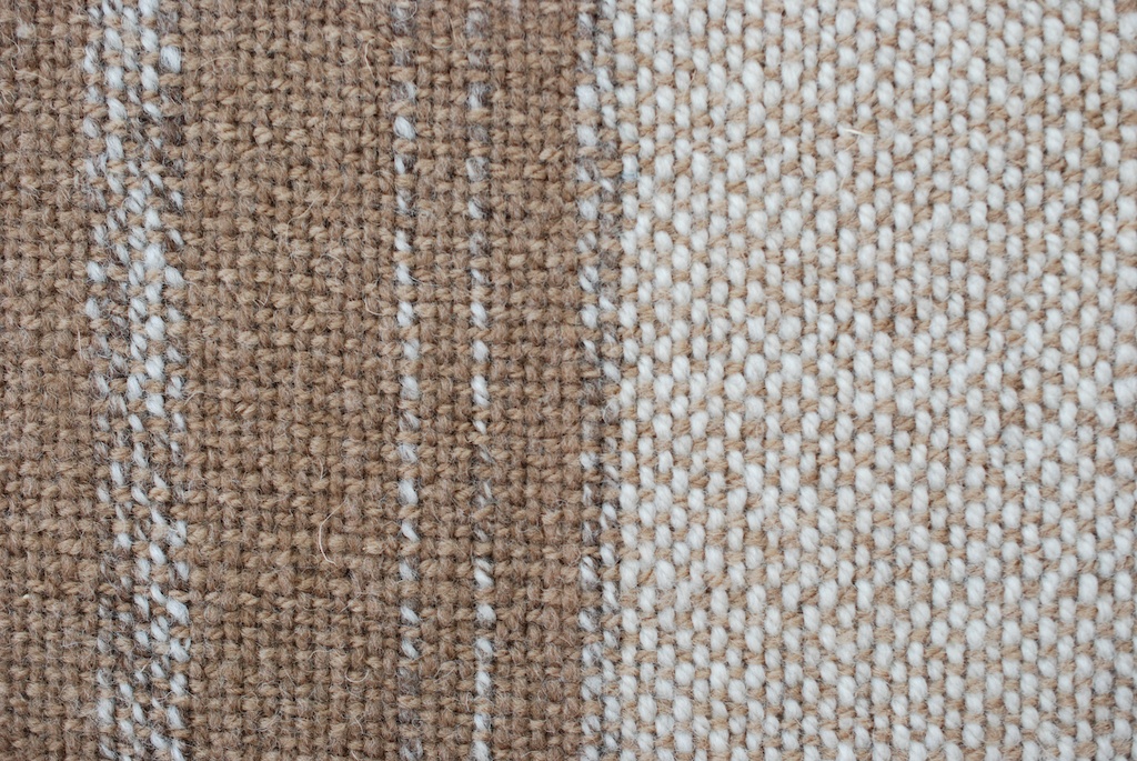
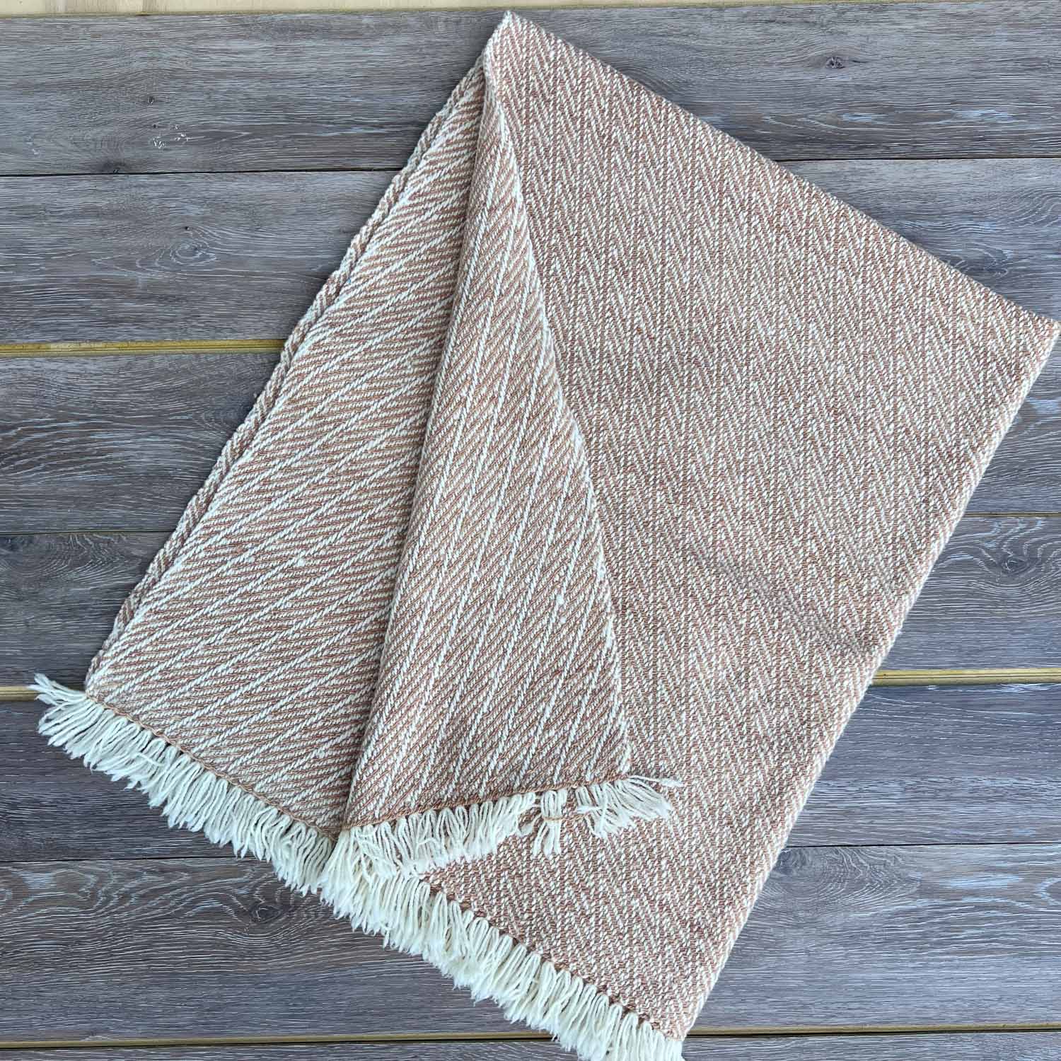
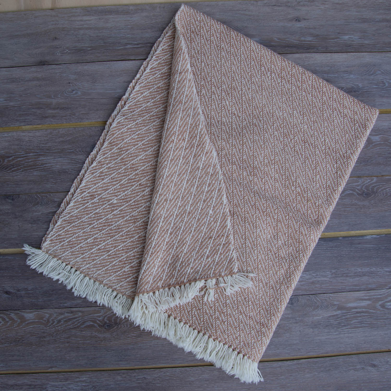
My warps are all numbered so I can find the info in my binder. This one is 1299 from January 2023, blankets on the AVL loom. My notebook shows that I wove 11 blankets on this warp, some of which were Year to Remember blankets. These three use temperature data from 2022 so the stripes are all the same, but the colors are very different. I weave custom Year to Remember blankets and use a sparkly yarn to distinguish the special date. I think I have enough warp still on the loom for one more of these this winter, so contact me if you want to know more.


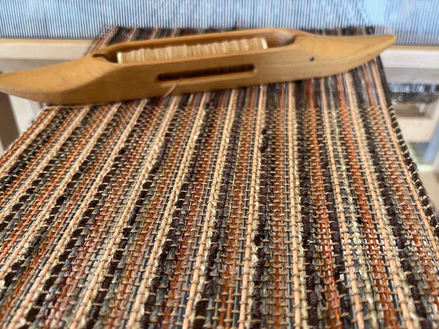
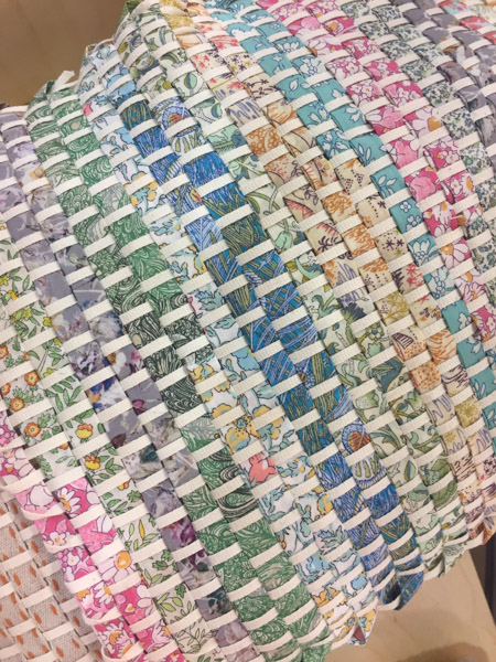
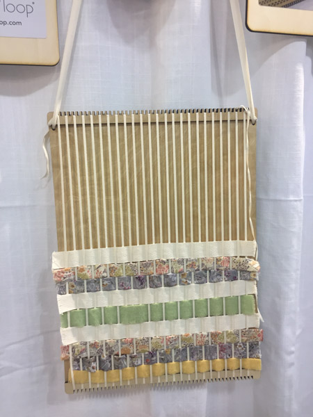
This is 1301 a scarf using all these crazy yarns. I teach a class in weaving a scarf using a mixed warp wound with a paddle, “Mix it Up”. I haven’t taught that class in awhile and I probably need to change it from a 1-day class to maybe 1-1/2 days. I don’t know if people want to pay for an extra day, but I always forget that it takes longer in a class setting than I take if I’m just warping and weaving my own scarf.

Two more mixed warps on the loom. The one on the right is a shawl, now at the Artery I think. I wove 5 or 6 of these in different colors.

In February I demonstrated weaving at the Sacramento Weavers Open House. I missed it this year because lambs were coming earlier than the previous year. I wove a chenille warp on Saturday and a wool warp on Sunday.

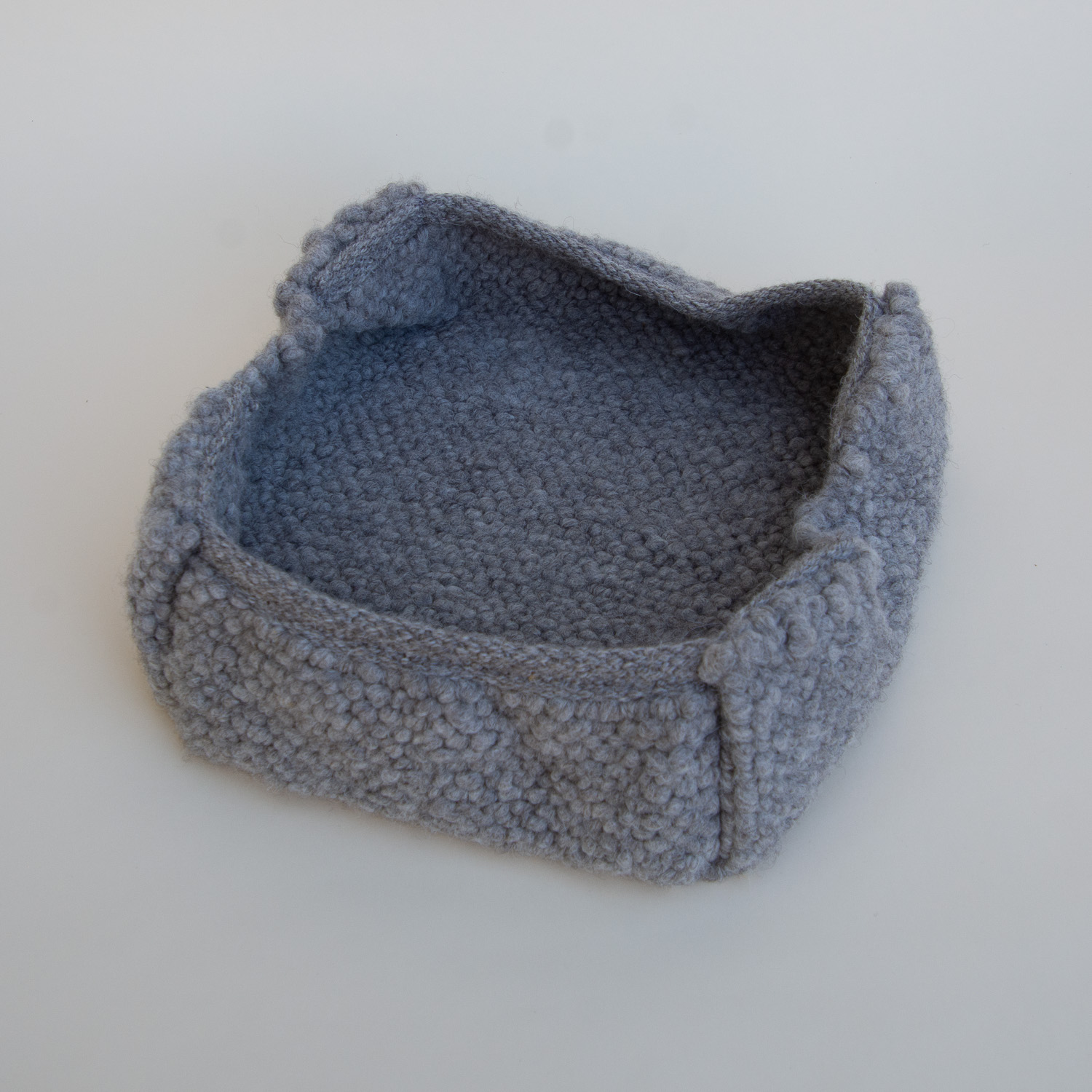
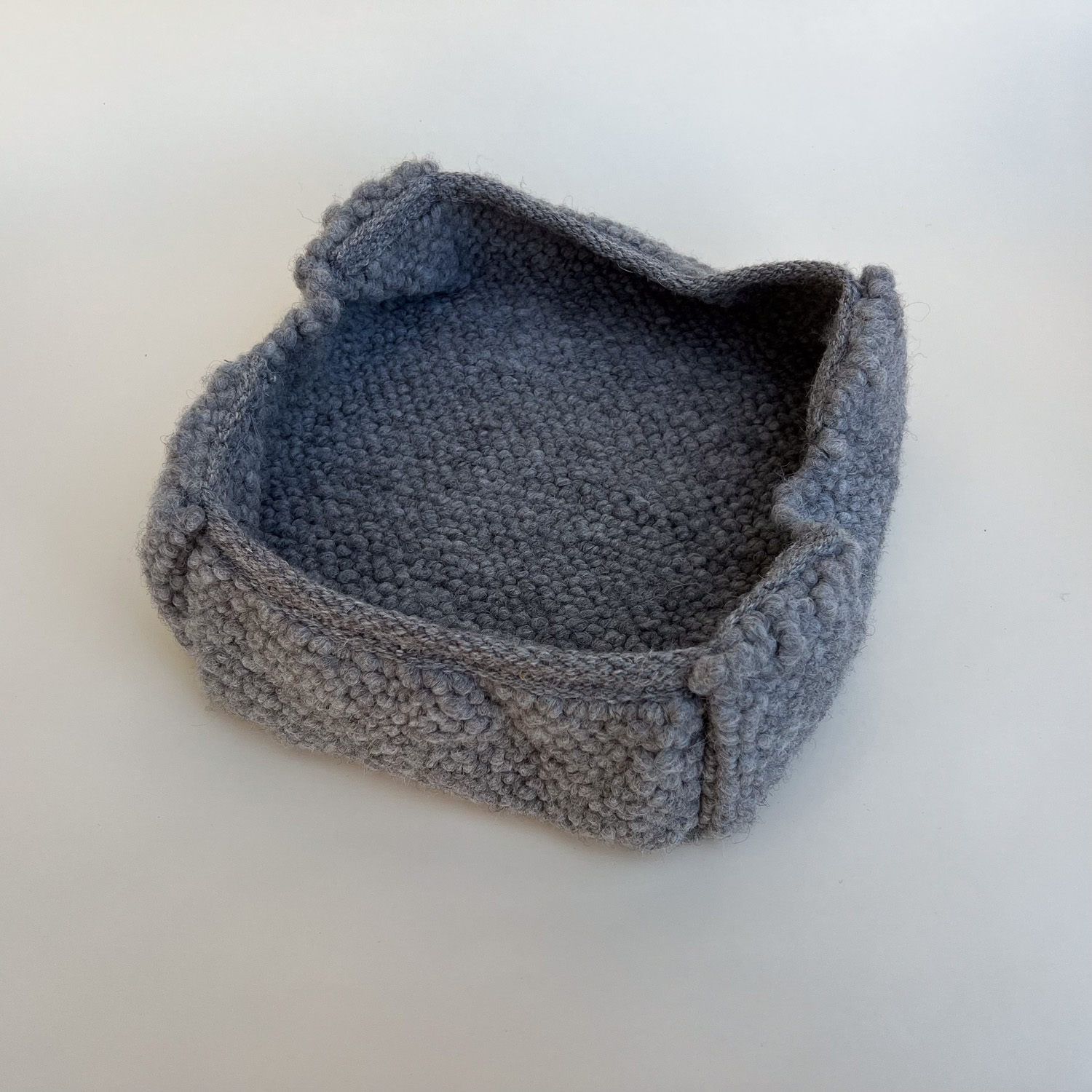
This is the warp after I took it off the loom.

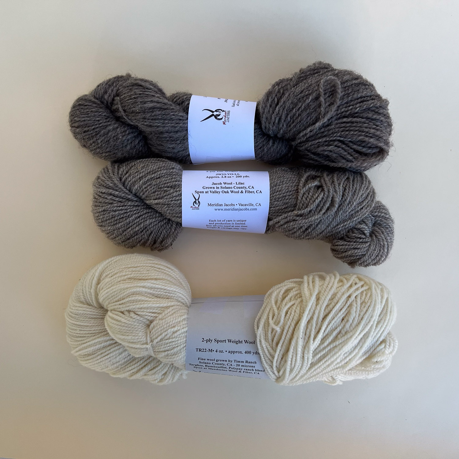
Warp 1317 was a handspun Jacob wool scarf. Two Farm Club members spun yarn from wool that was accumulated from years of samples sent in when registering rams. Each ram application requires a few locks of wool. We have been digitizing the papers and that means those baggies of wool are discarded. I decided to do a project like this and then donate the scarf to the Jacob Sheep Breeders raffle. I wove two scarves using wool two different people had spun.

Clasped Warp is a technique that I wrote about for Little Looms a few years ago. It has been used with rigid heddle looms to design warps that change color midway through the length. I decided to do the same thing on a floor loom, adding the woven in pattern to the elements of interest. This is a shawl woven on a 4-shaft loom using handspun yarn. I will have an article coming out in the next Handwoven on this technique.

I wove fabric for 4 bags to use in an article that was published in Little Looms last year. These are hemp and woven on a rigid heddle loom. The bag uses a length of fabric that is 8″ wide and 4 yards long. Folding it strategically gives a shoulder bag with and inside and outside pocket.

This was part of that last blanket warp. It used up odds and ends of the Ashford DK yarn that I use for the Year to Remember blankets. The shape isn’t exactly right because that warp is designed to weave throws that end up about 45-50″ wide. I wove random stripes and sewed two together for a bed-sized blanket. I should have woven them longer and then they’d fit the bed correctly, but I didn’t have a plan at the time.
More to come if I’m going to finish out the year.


 This photo doesn’t do justice to the pile of stuff. Most of them are still out in the aisle. A couple of people stopped by and were amazed that I actually fit it all in. What you don’t notice in the photo because of the black drapes are the 16 gridwall panels that create the booth. Those get heavier every year.
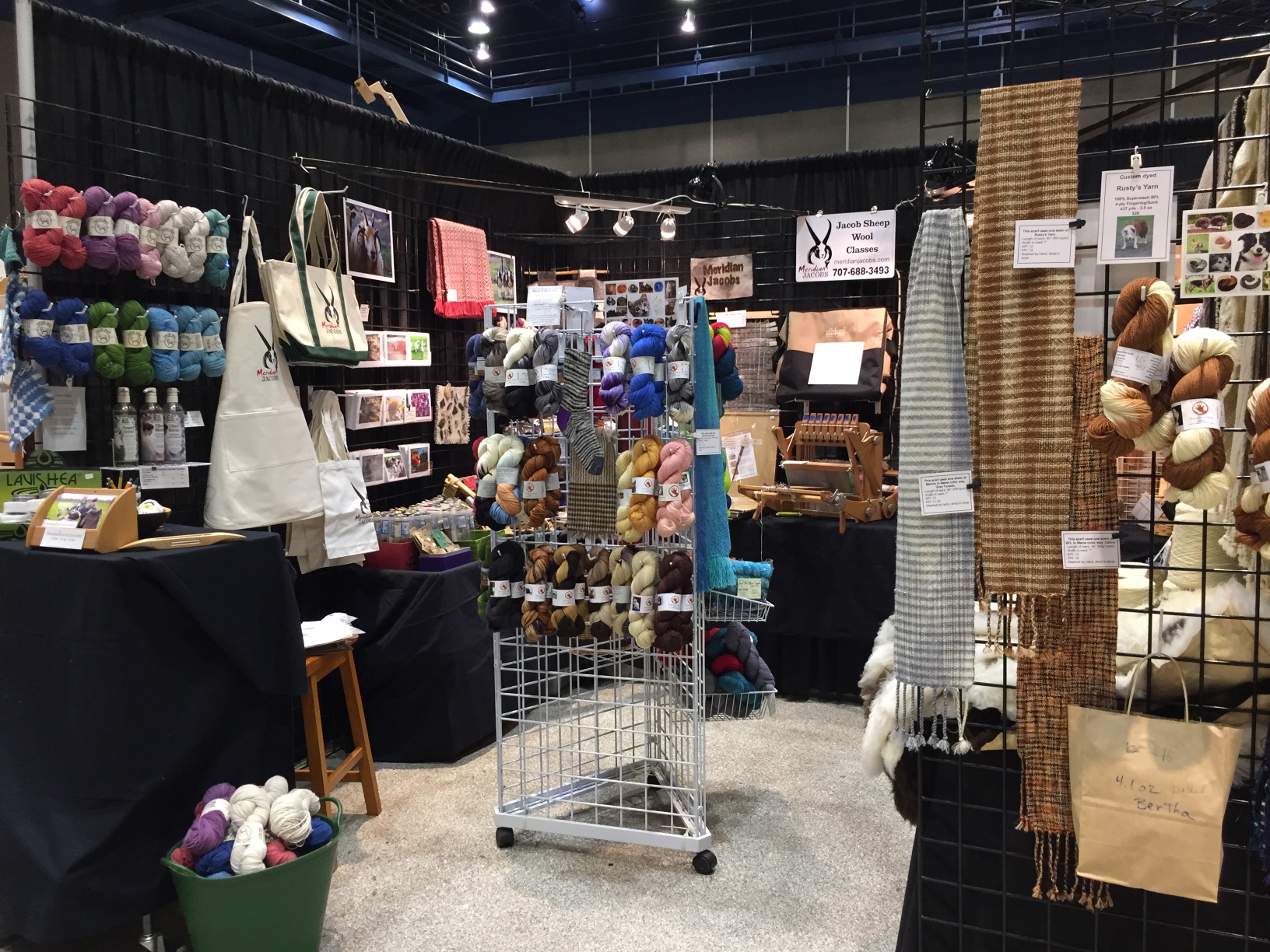 I got to Modesto about 4:30 p.m., worked until 8:40 on Thursday and then from about 9:30 to 1:30 today. The show opened at 2. Here is a tour of my booth:
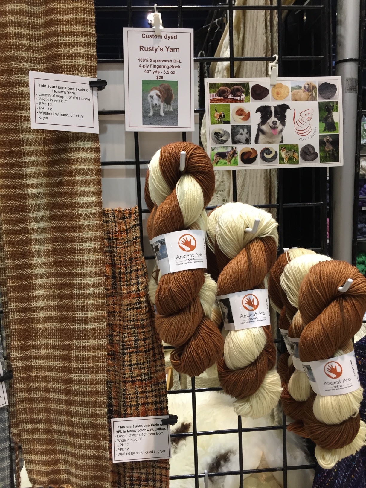 Rusty’s Yarn faces the aisle.
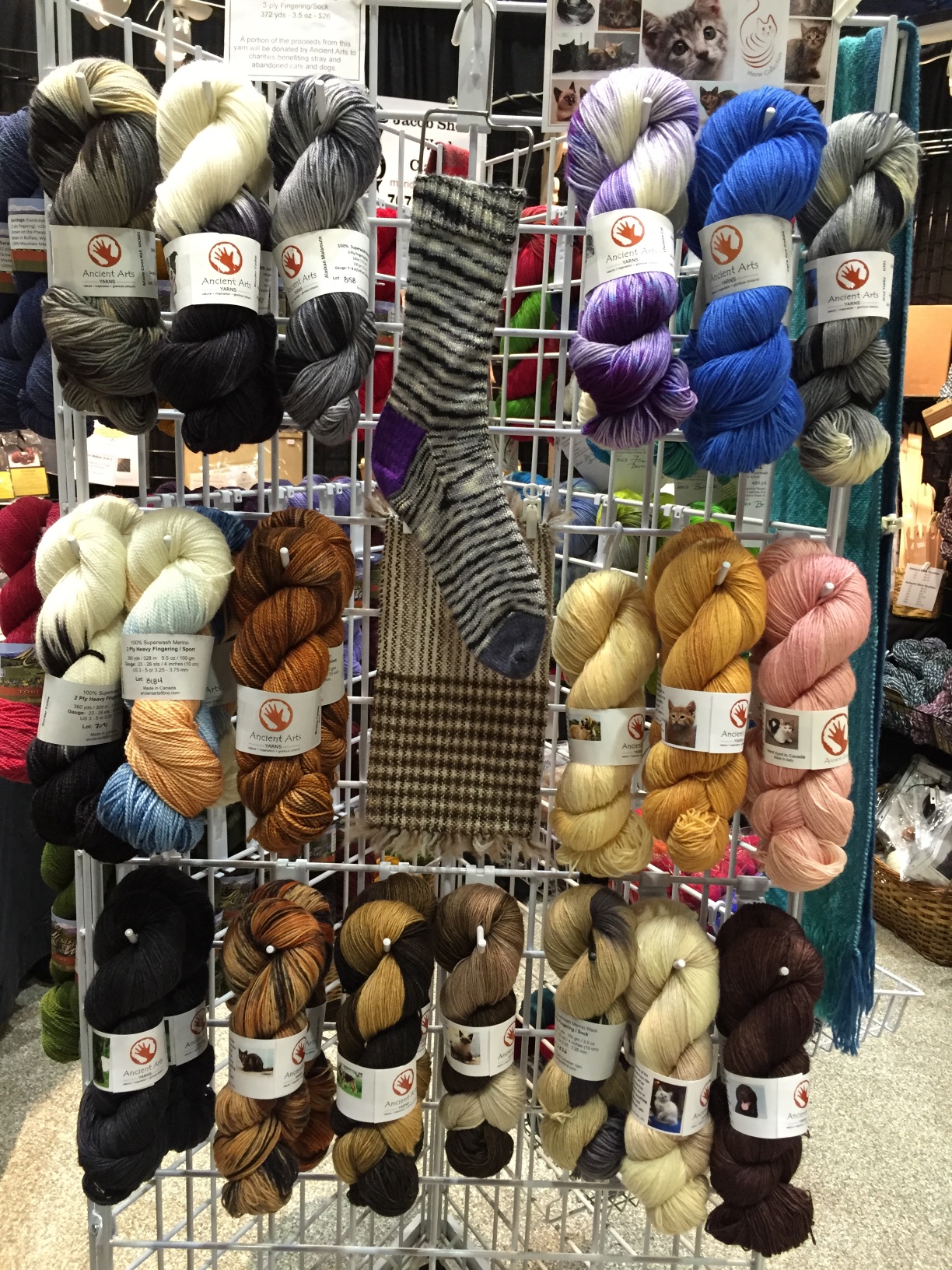 On the 3-grid tower in the middle I have the Meow and Woof yarns…
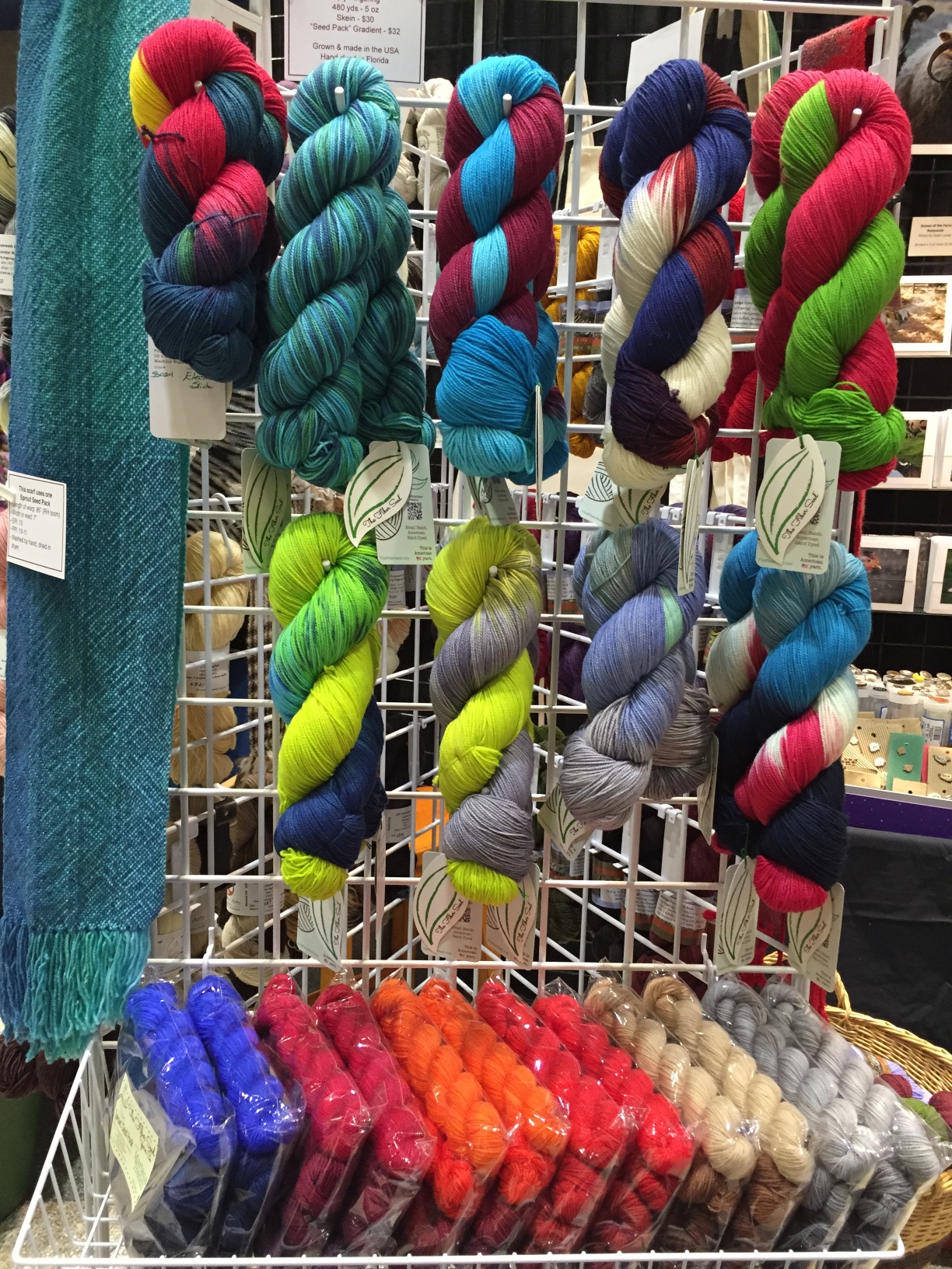 …Sprout yarns…
 …and Mountain Meadows, all fingering weight yarns with sample scarves.
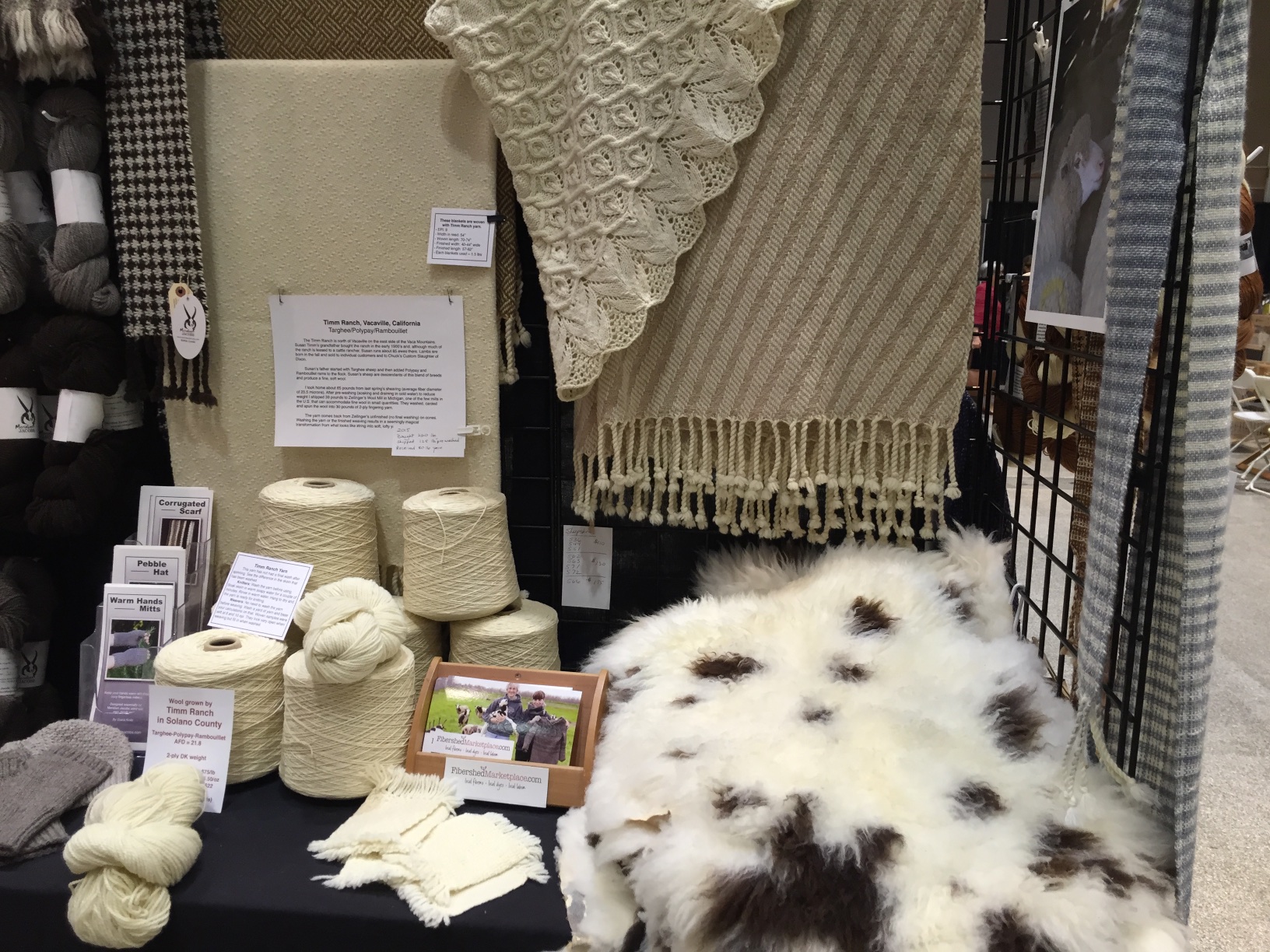 Around the inside of the booth is the Timm Ranch yarn with blankets I wove and Mary’s beautiful shawl. There are Jacob sheepskins too–only a few left.
 Moving to the left there is the Jacob yarn and Imperial Yarn Company’s “Anna”, a wool/cotton yarn that weaves up quickly (at 5 epi).
 Going around the back wall I have rigid heddle looms from Ashford and Schacht and the Ashford “Katie”, which is a wonderful very portable 8-shaft table loom.
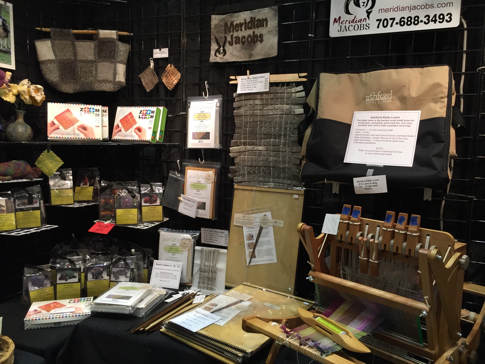 Purl & Loop Stash Blaster looms and Swatch Maker looms are brand new. Next to them are the Zoom looms with the critter kits that use squares made on the them.
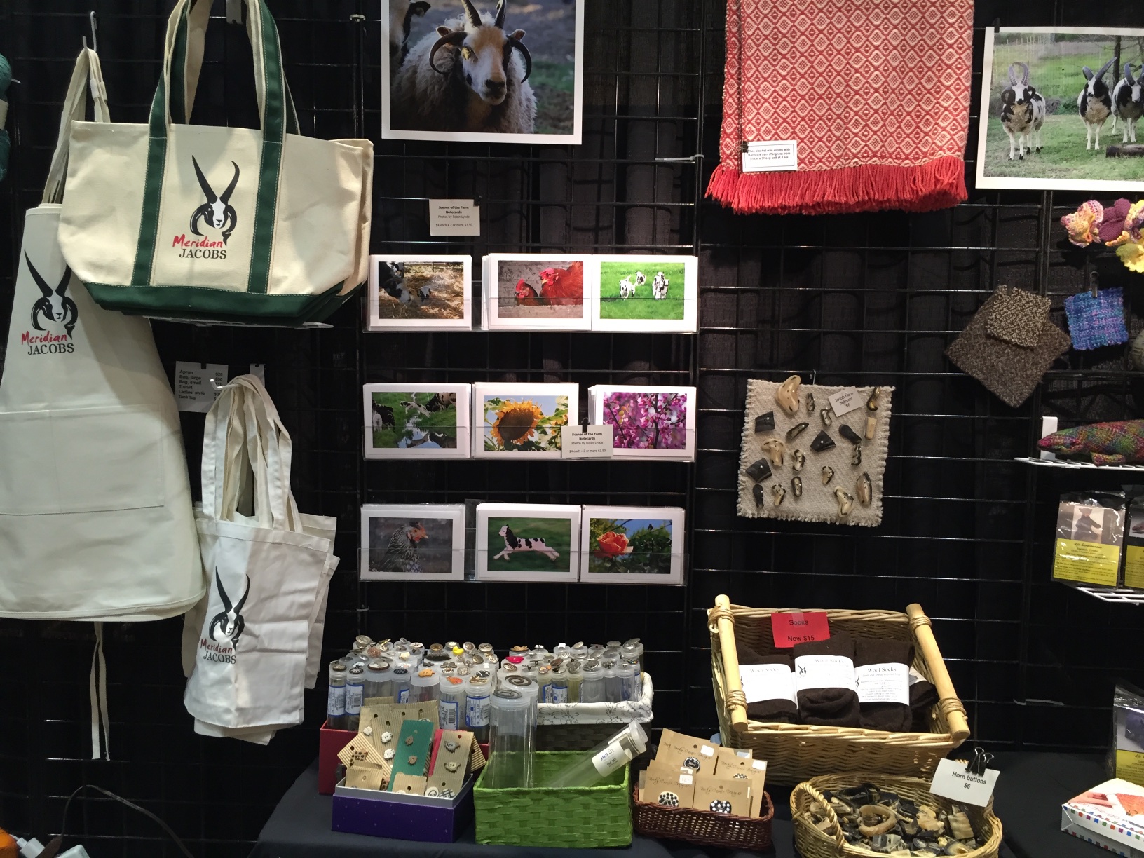 Coming around the corner I have photo notecards, buttons, and Meridian Jacobs bags and aprons.
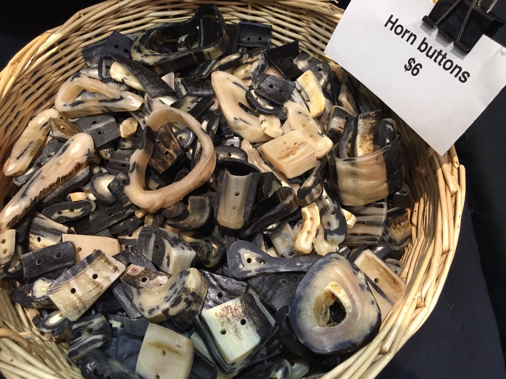 I have added to the horn buttons. My son helped finish off another batch.
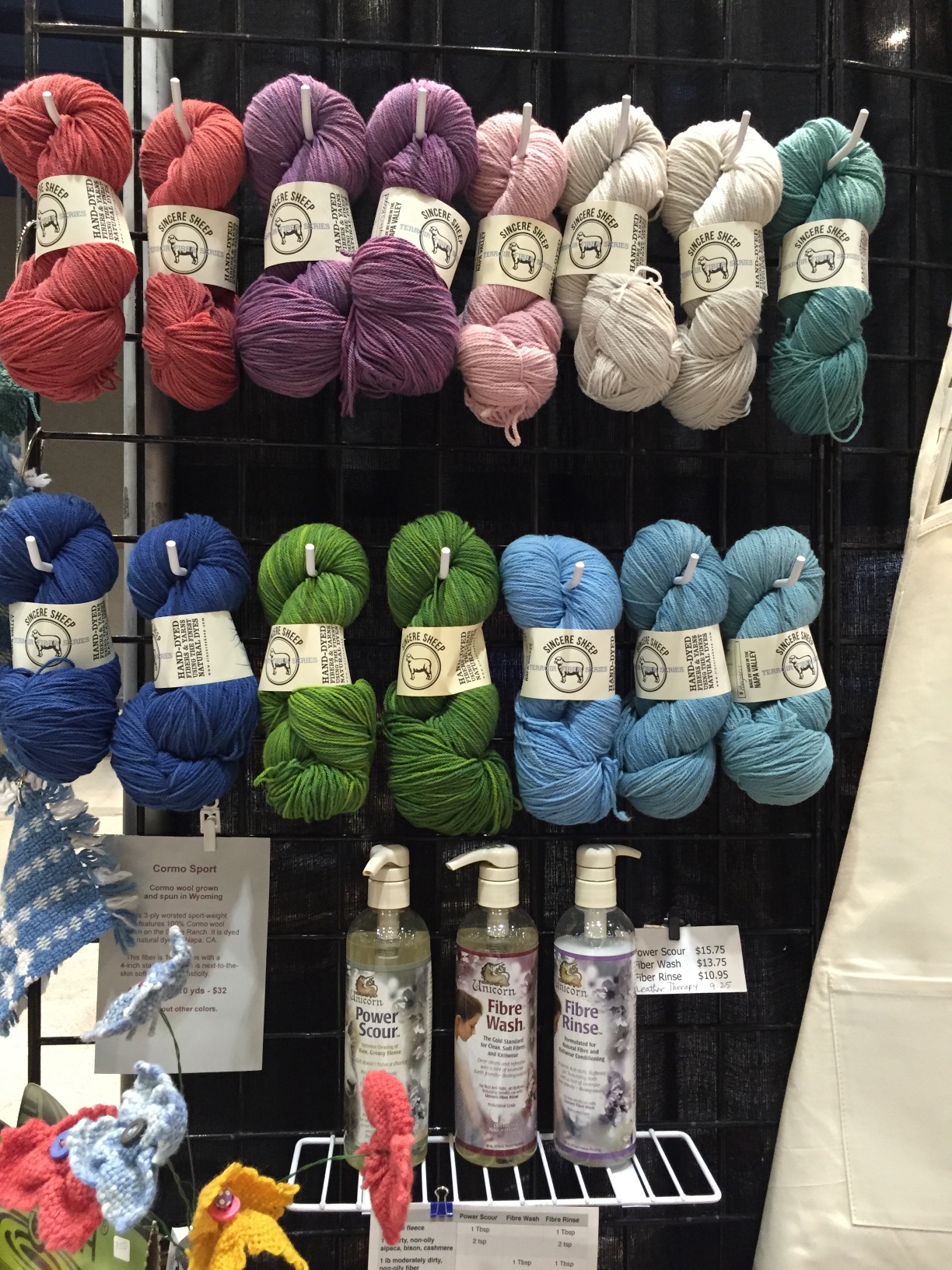 Last there is Cormo Sport yarn dyed by Sincere Sheep. You can see one of the samples that I wove. It is incredibly soft and spongy (not a good wool term, but is it better than squishy? I probably need a different adjective, but it’s late.) I brought Power Scour, etc with me but barely found room for a few bottles.
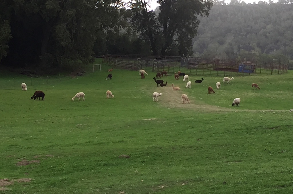 When I asked how many alpacas there are, Mary said between 150 and 200. They roam the hills on the ranch, accompanied by guardian dogs.
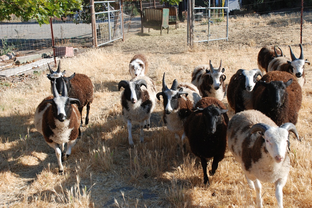
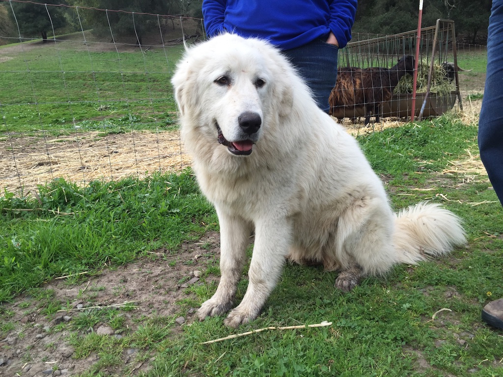 This is one of the many ranch dogs that include guardian and herding dogs. We were told that this one is only 8 months old.
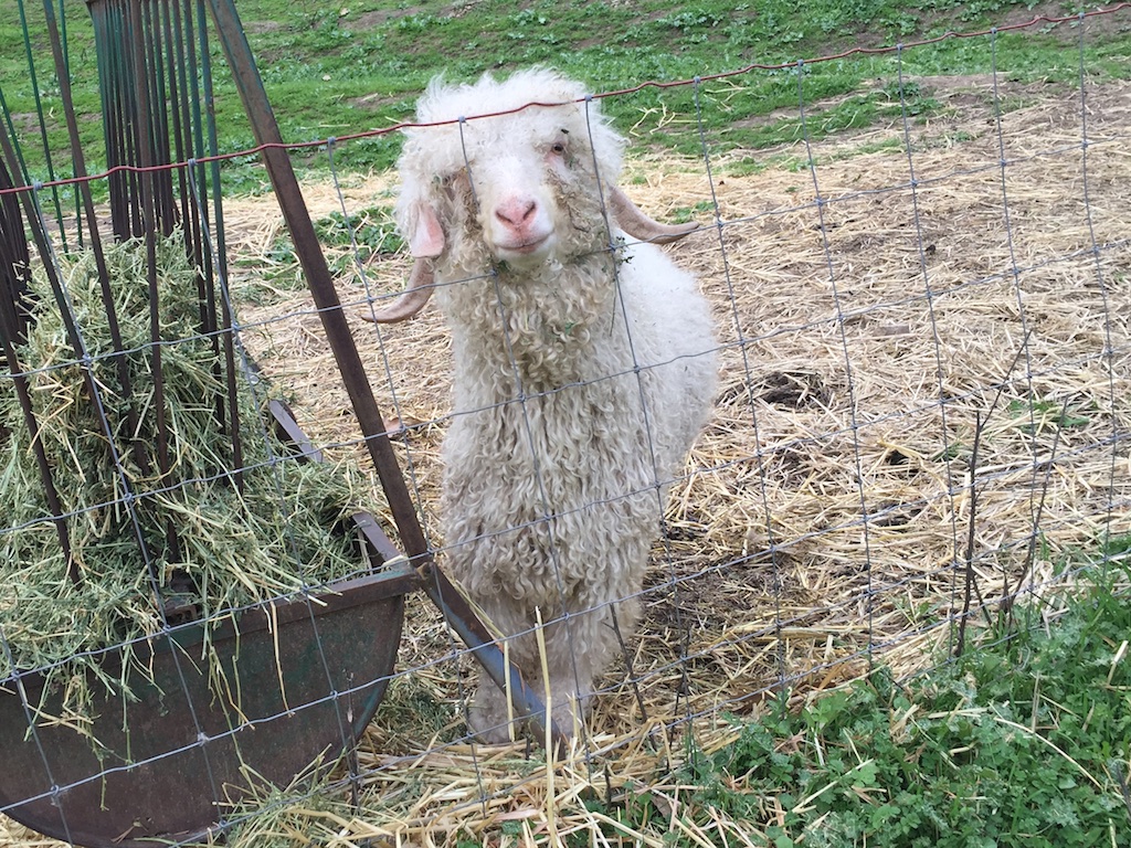 Our meeting was in the greenhouse located near the field where the bucks live.
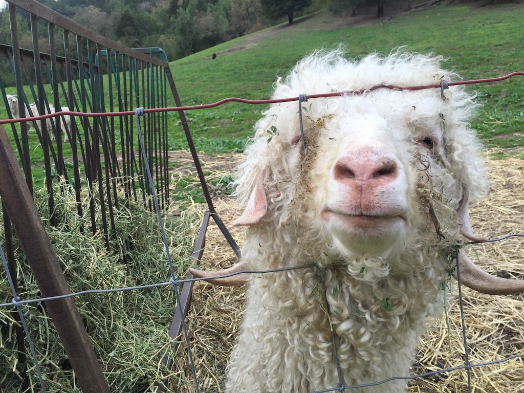 This guy seemed pretty friendly.
 Before we started the meeting we admired each others fiber products. This is one of the Twirl yarns produced by Mary.
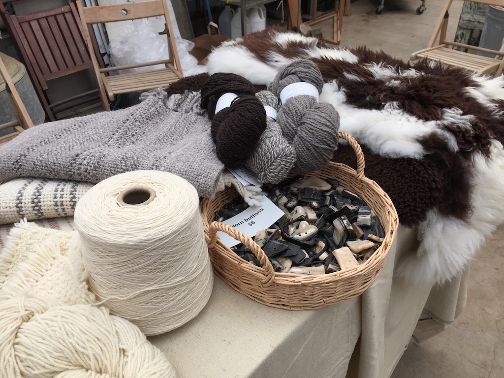 This is what I brought to share–sheepskins, buttons, yarn, and shawls from my Jacob sheep. The new
 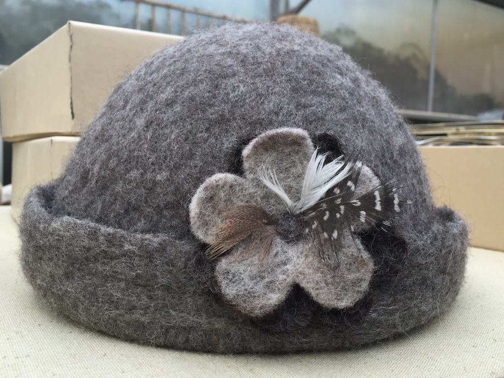 This is a felted hat made by
 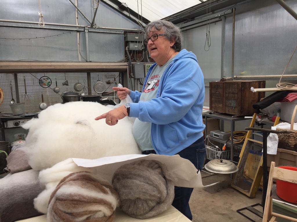 Here is
  …and this is a piece she felted from the wool of Vicki, one of my Jacob sheep.
 We were able to see the recently produced Wool and Fine Fiber Book. Each producer has a spread in which samples of their fiber is attached. These books will be circulated to designers and manufacturers who want to find out what kinds of fiber are available locally, how to contact the producers, and to learn how these fibers might be used in end products. This was an amazing undertaking by Fibershed.
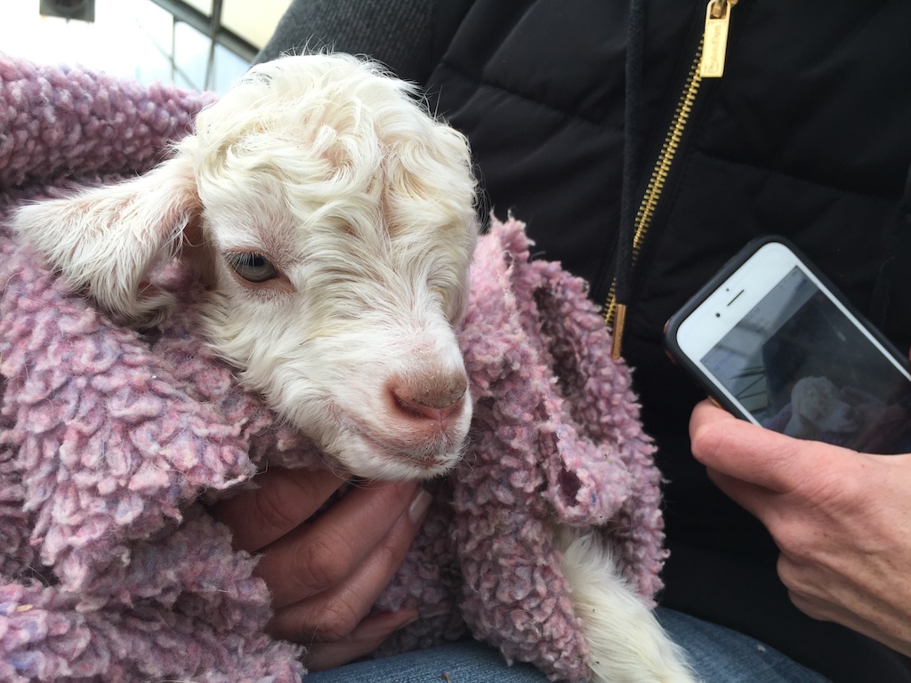 While hearing about all this we were also doing what Fibershed producers do best, eating and baby animal snuggling. This is a two-day old kid who needs some TLC.
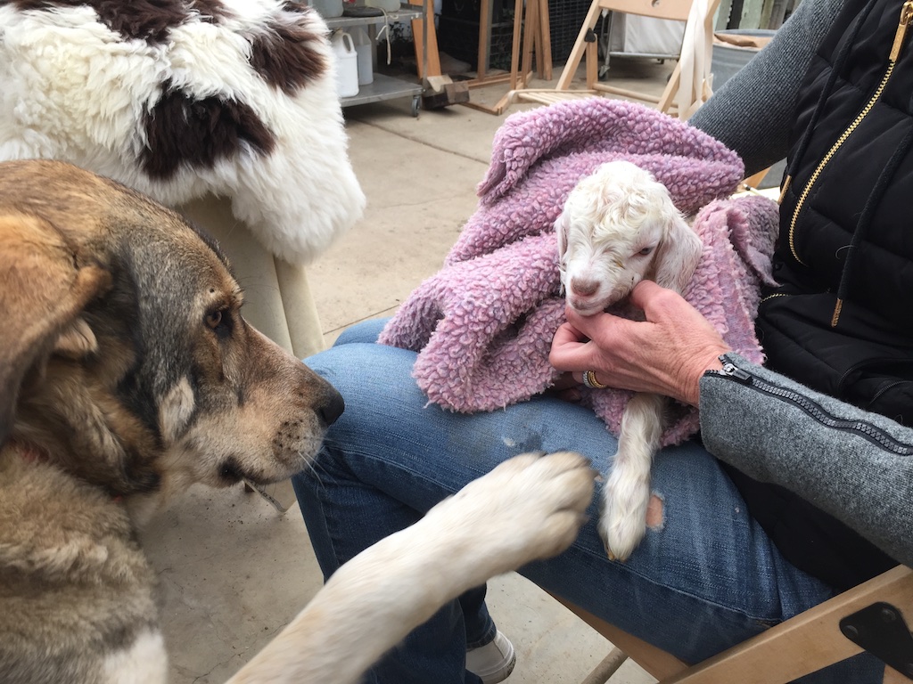 One of the dogs was feeling left out.
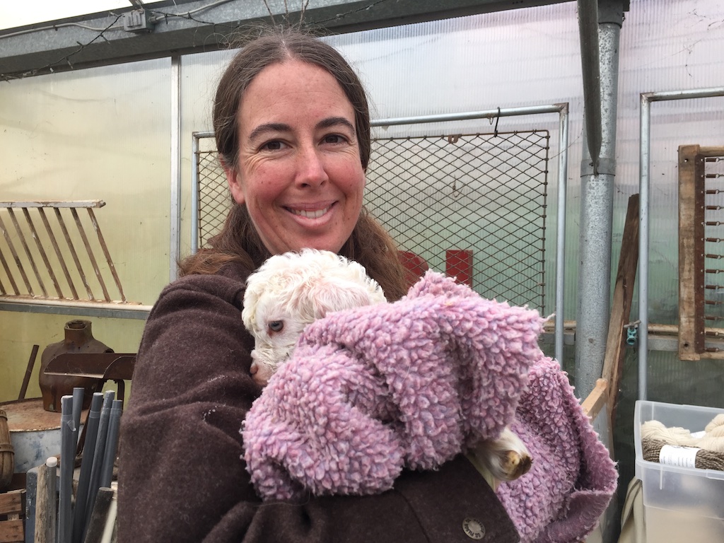 Even Rebecca found some goat snuggling time.
 I hadn’t had a chance to do anything with it until recently. The first step was to gather some information.
 The McMorran yarn balance is one tool to do that. You trim the ends off a strand of yarn until the arm balances.
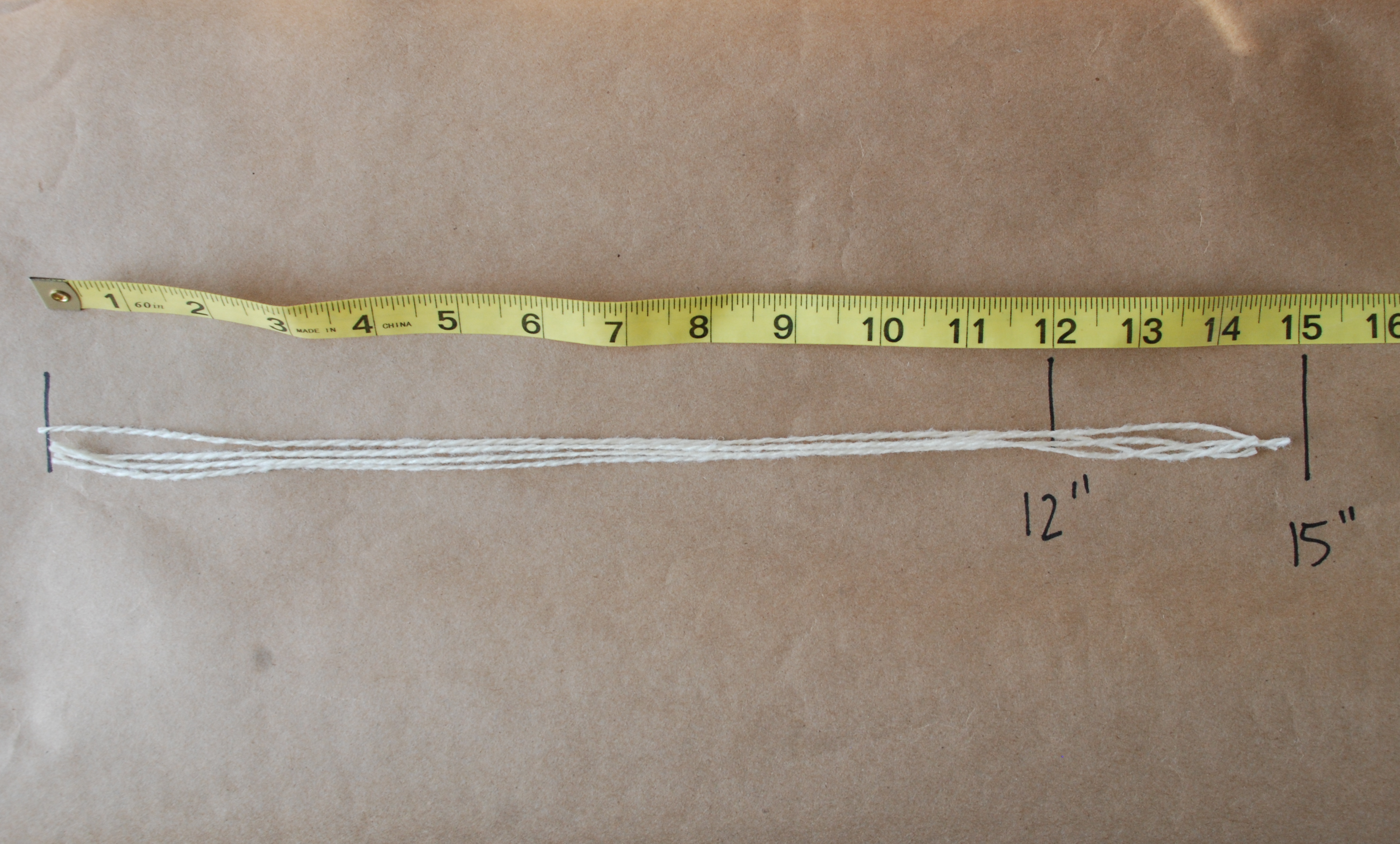 Then you measure that length of yarn and multiply by 100 to get ypp (yards/pound). I repeated that a few times to get an average–1500 ypp.
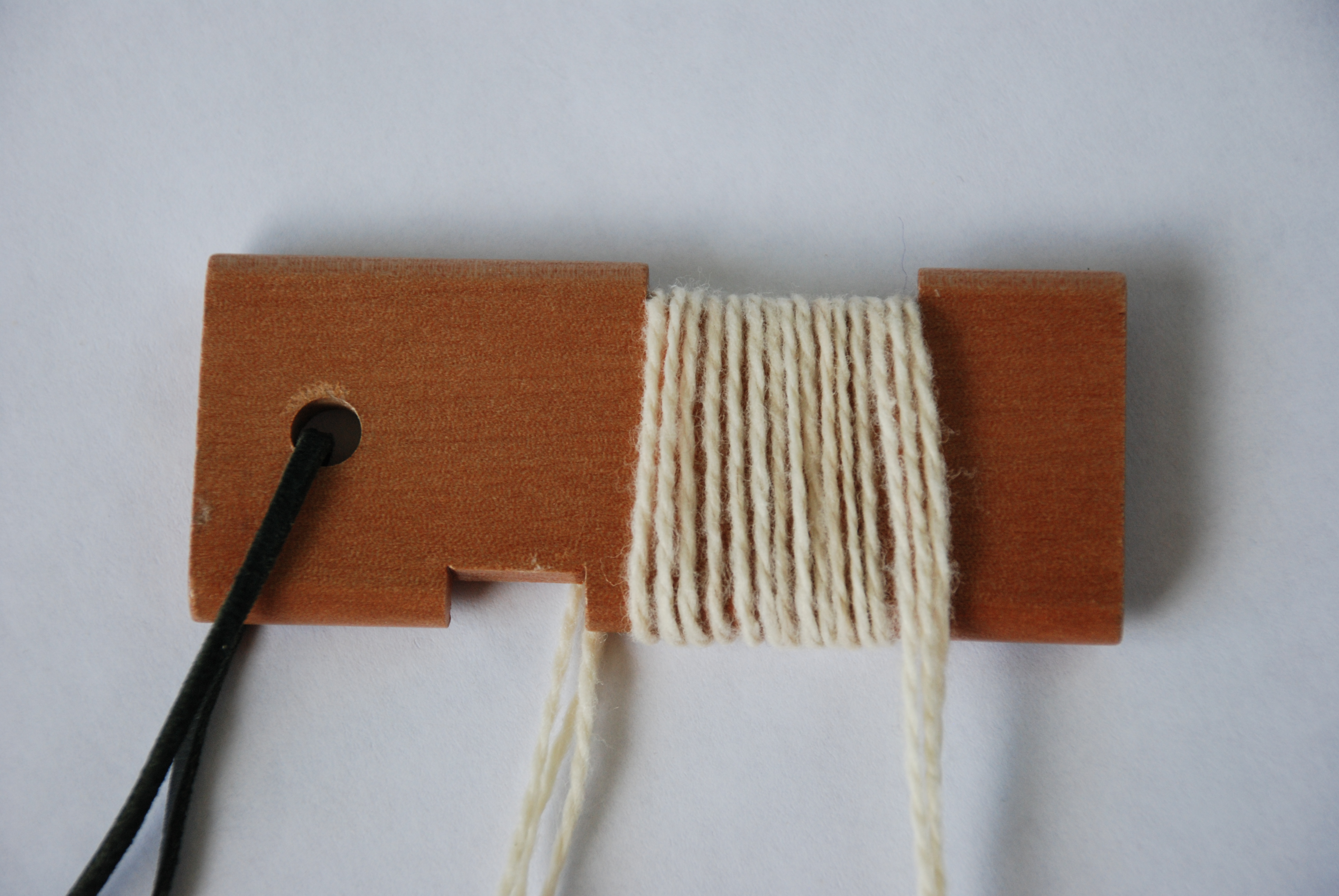 Another measurement is wpi (wraps/inch). This yarn measure 15 wpi. However, from past experience I know that this isn’t quite accurate. Most yarn is scoured (washed) and skeined before it is sold in yarn stores. That can have a dramatic effect on the yarn. The yarn that I got from the mill on cones has not been scoured yet, so it is not really “finished”.
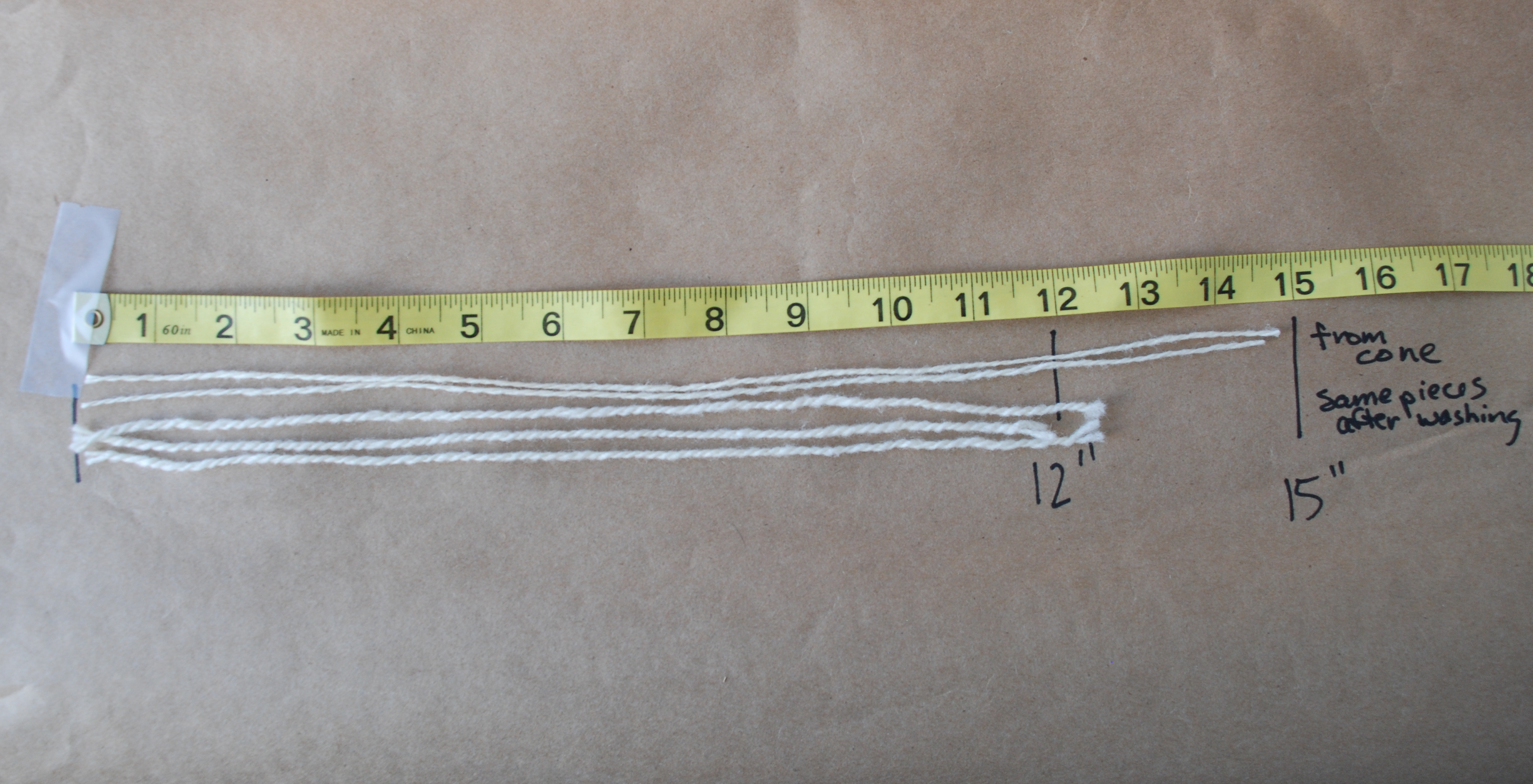 Look at the difference a soak in warm water makes. Now this yarn measure 1200 ypp (which is what the specs from the mill were)…
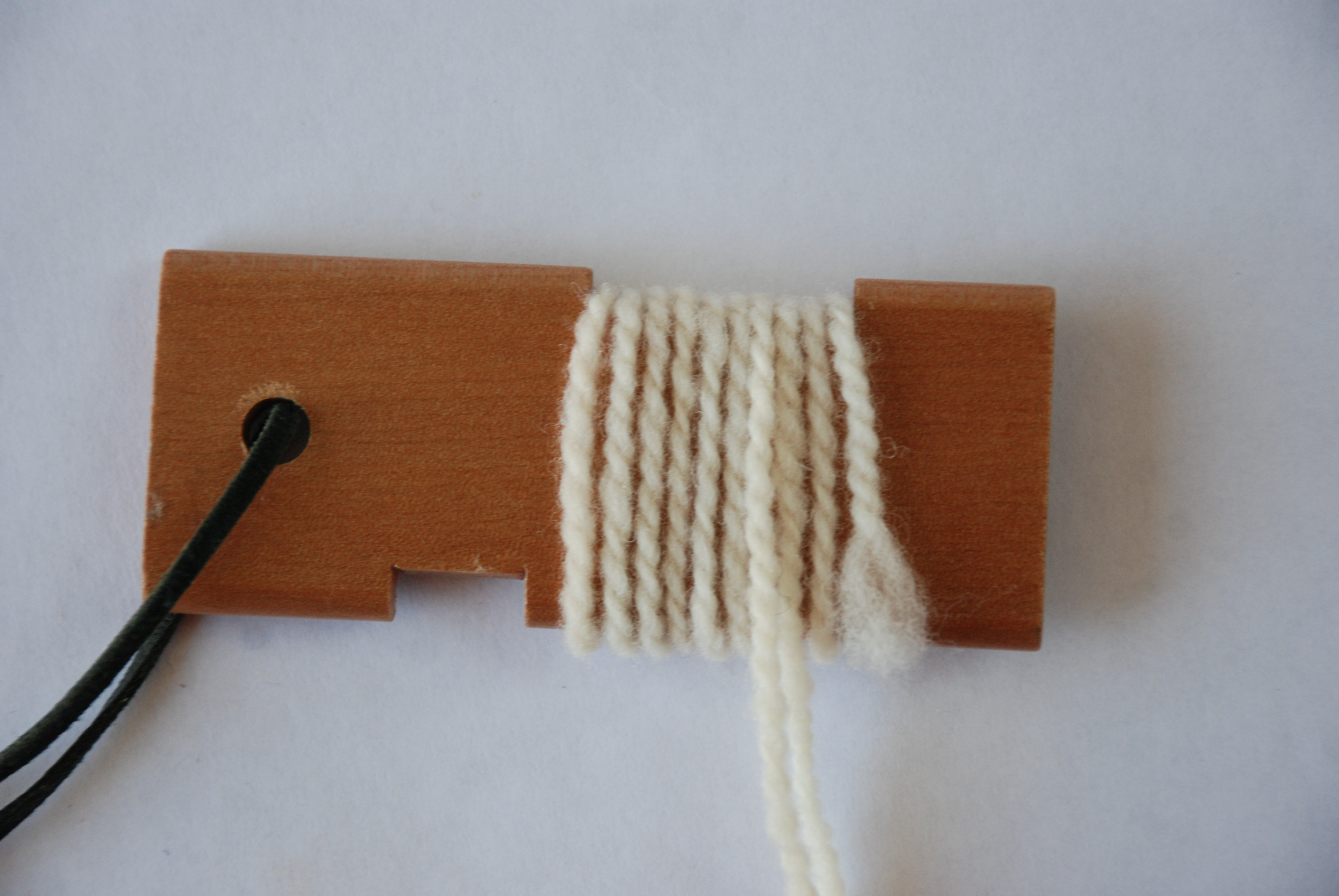 and it is 10 wpi. Based on those measurements I wove some samples.
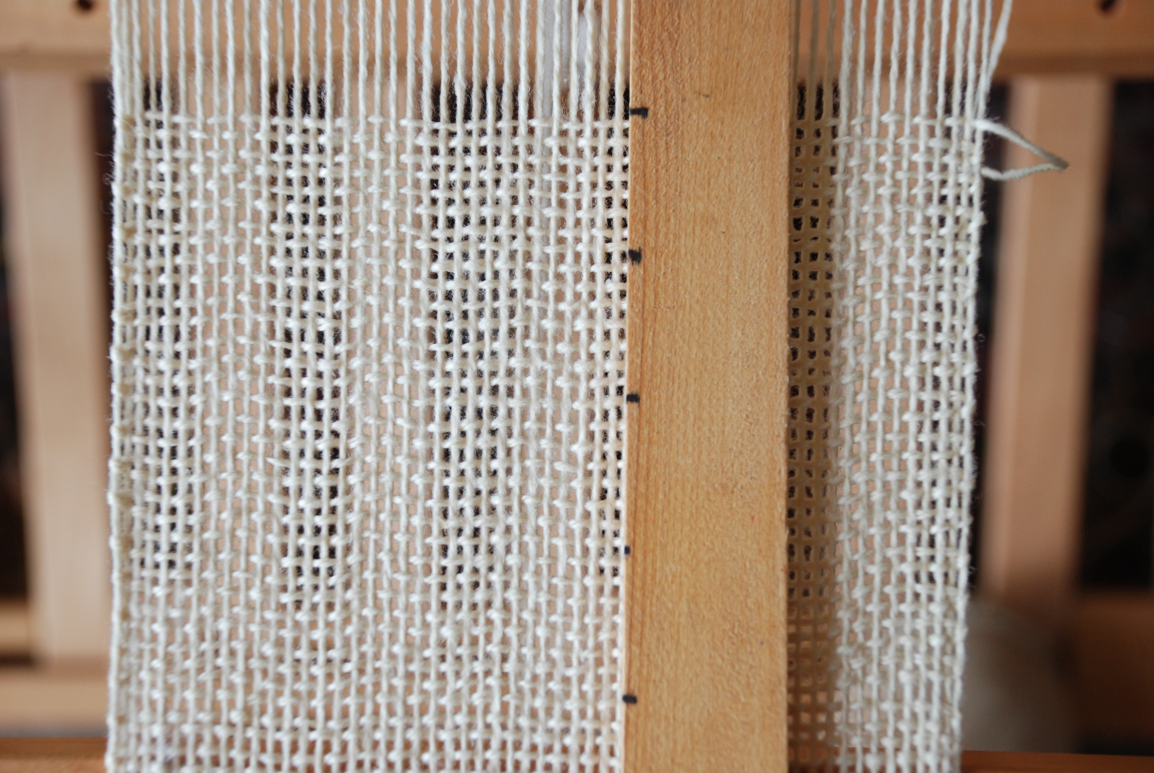 These samples look pretty open on the loom…
 …and I had to be careful to not beat the weft yarn down too much.
 This is how the samples look off the loom. The 8 epi samples are in the top row.
 And here is how they look after a quick wash. Dramatic difference from the loom to the finished fabric.
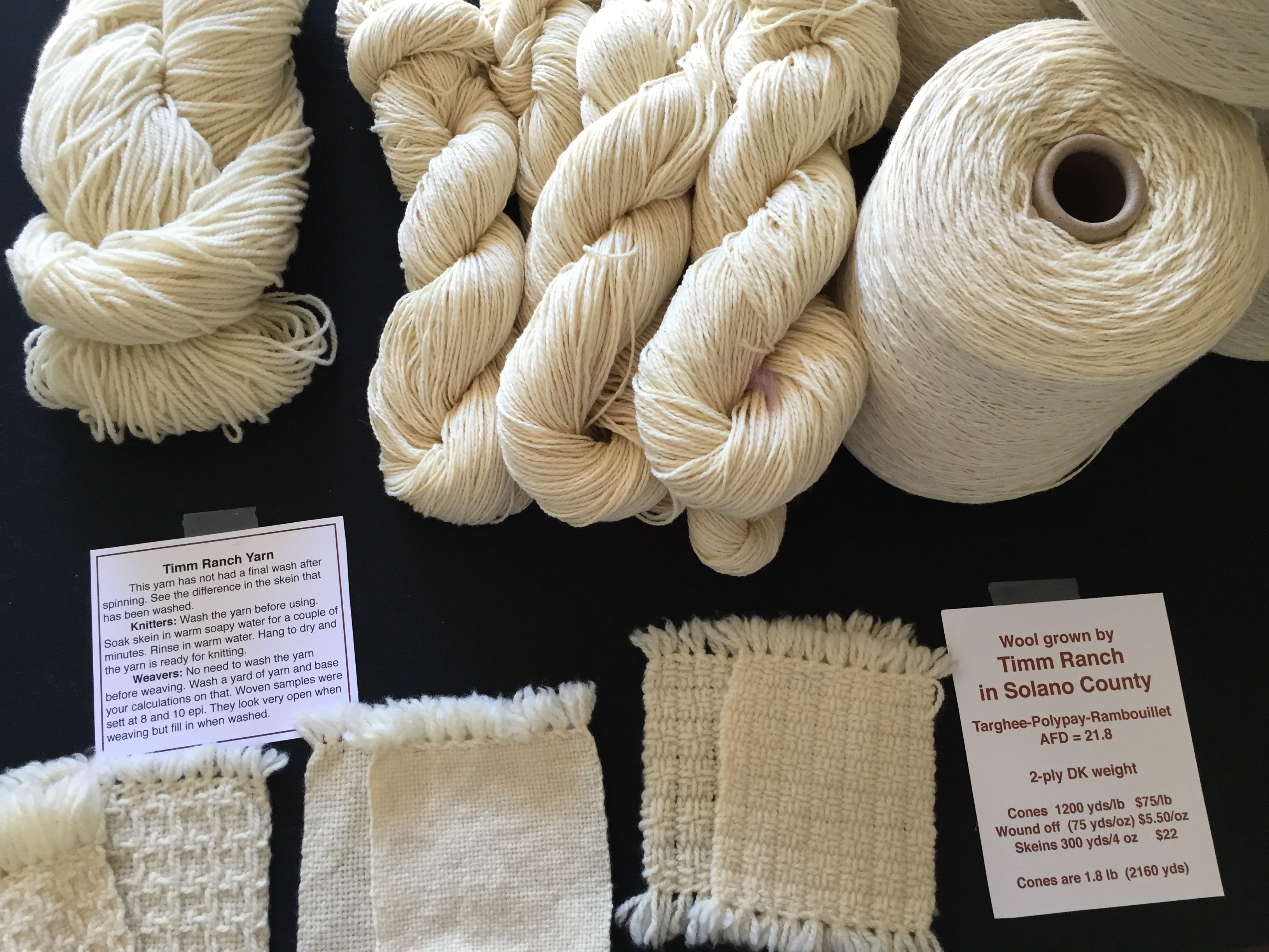 Here is how I had them displayed in the shop at the recent Shearing Day. The skein on the left has been washed. But these yarns aren’t just for weaving. My friend, Mary, bought some, washed it, and then used it for a Mystery Knit Along. Here is the shawl she knit.
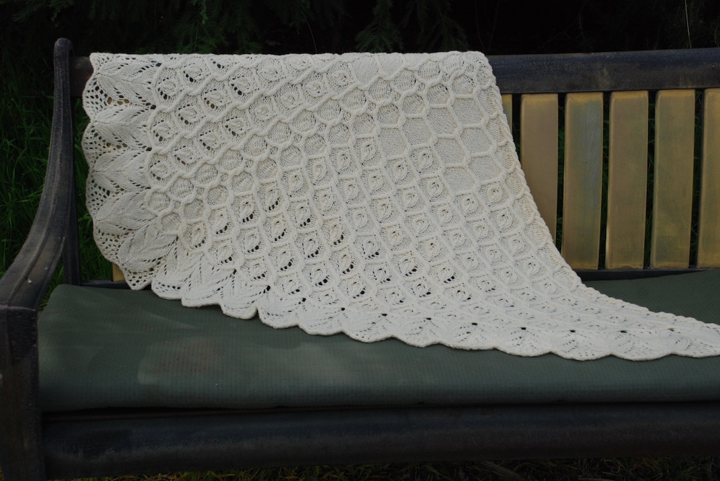 This was knit over a few weeks with a new direction given out each week.
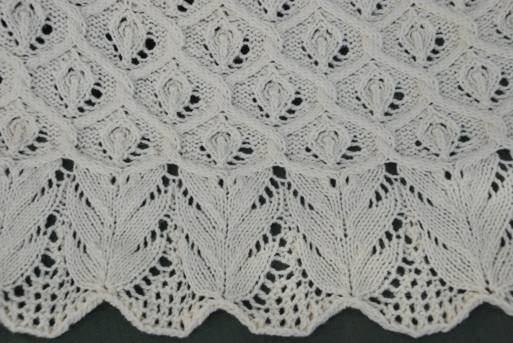 It is gorgeous in person and has a wonderful hand. I can’t wait to get some of this yarn on the loom and get to work with it.
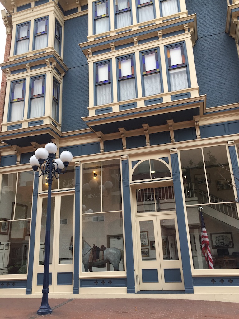 This is the beautiful Horton Grand Hotel…
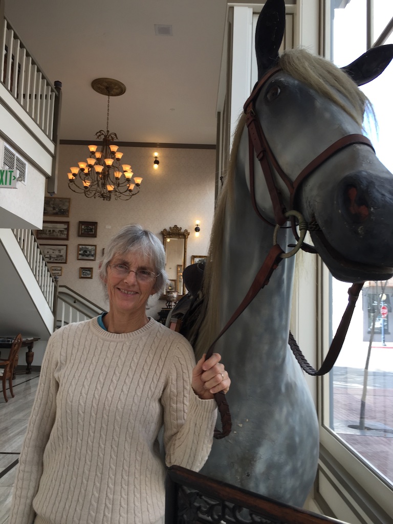 …and this is Sunshine, a paper-mache horse who stands in the lobby. He came from the saddle shop that was on the ground floor of the neighboring less formal hotel. The hotels were built in the mid 1800’s but the saddle shop originated in 1912. Wickipedia says: “Both hotels were scheduled for demolition in the 1970s when the City of San Diego purchased them to build the Horton Plaza shopping center on the site. The hotels were dismantled brick by brick, with each brick numbered, catalogued, and stored. In 1986 the hotels were rebuilt into an entirely new hotel at the present location at Fourth Street and Island Avenue.”
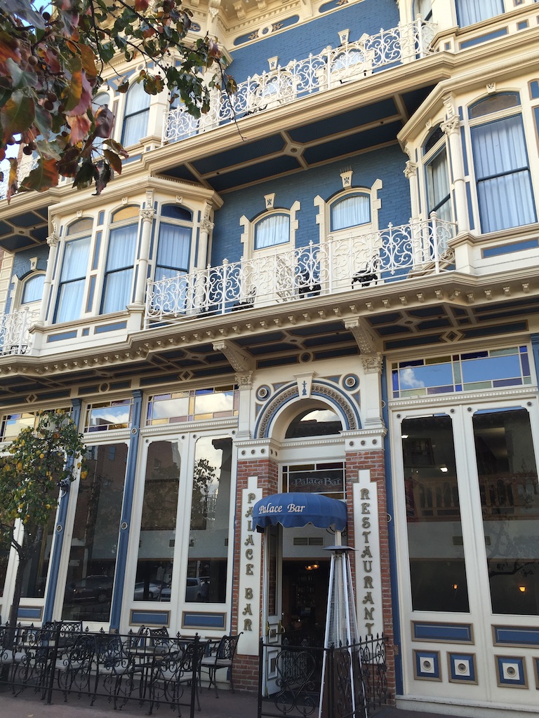 Our room was lovely.
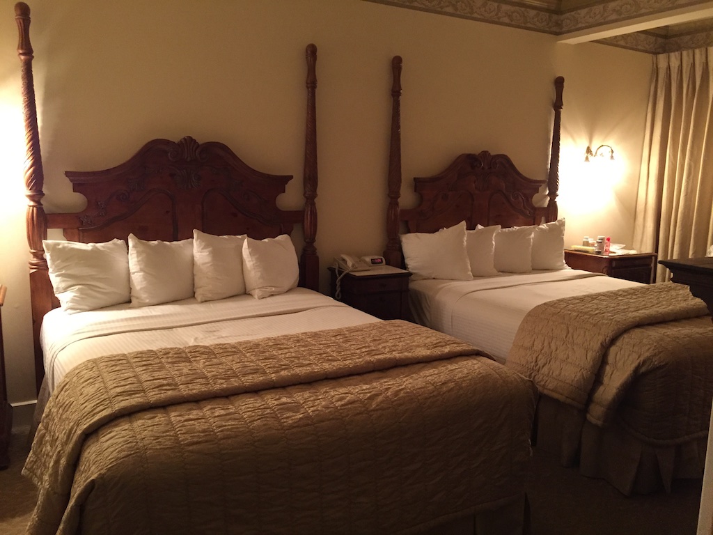 What fun to decorate a hotel like this. The furniture was all old so I assume it was found at estate sales and flea markets. We even had a fireplace (gas so no wool hauling).
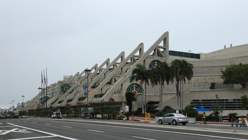 We spent a lot of our time at the San Diego Convention Center.
 Here is a message to be read on the way there. This quote in context of time and author if quite serious. In my world the last sentence has particular meaning and is serious enough in my life, if not with as profound a meaning.
 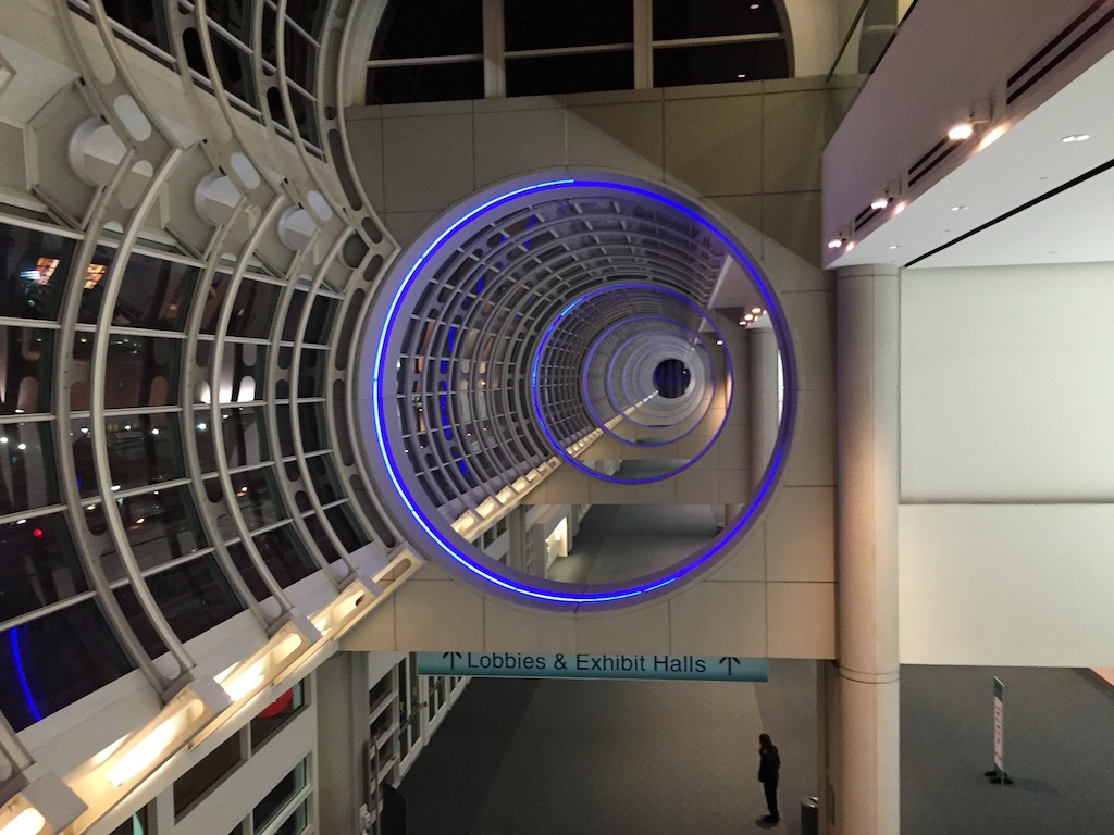 Fun view while going up the escalator in the Convention Center.
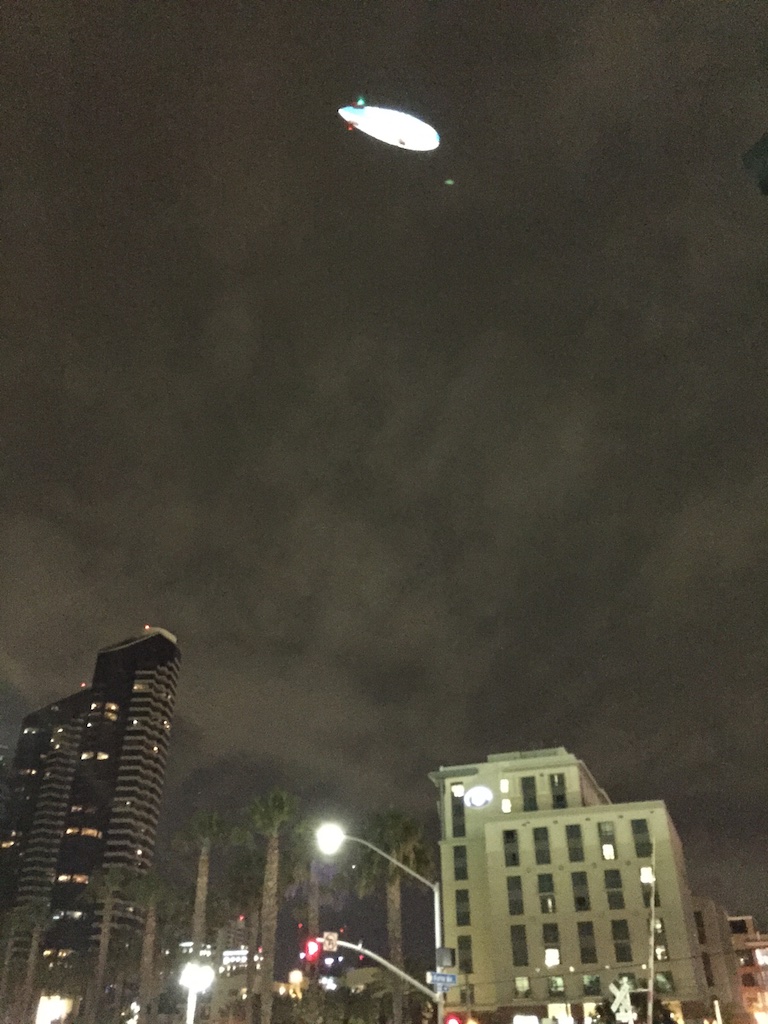 Leaving the hotel at night. This is the Gas Lamp District, kind of like Old Sac is for Sacramento.
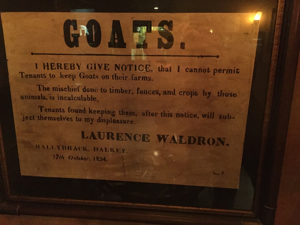 We ate one night at The Field, an Irish pub, while listening to Irish music and dancers. This sign caught my notice.
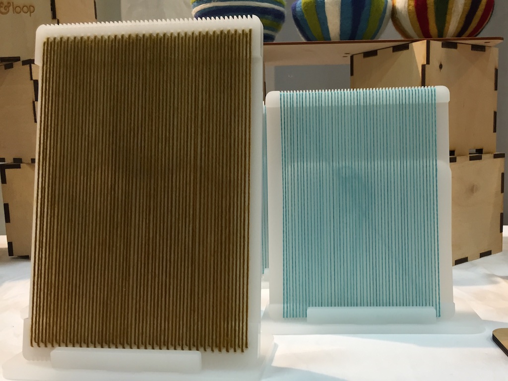 But first I found some new equipment. These are prototypes of cool little sample looms designed by author and teacher, Liz Gipson. The unique thing about these looms is that they will be produced in 8, 10, and 12 epi versions, enabling quick sampling of yarns at those setts (and at 4, 5, and 6 epi). There are a few other gadgets I am purchasing here as well.
 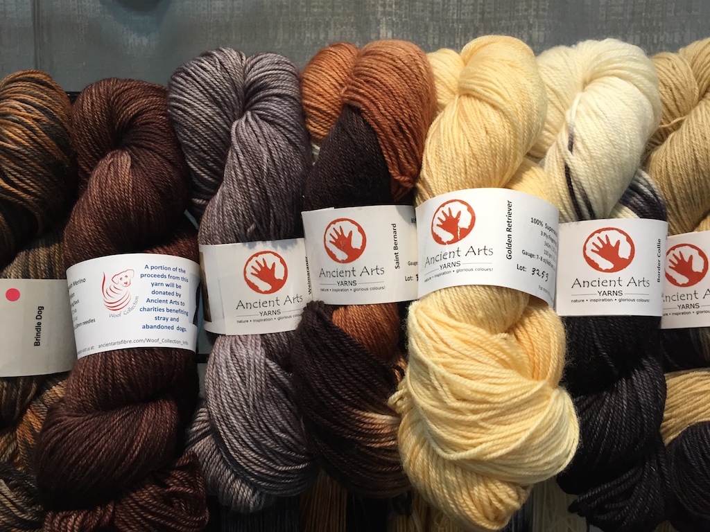 This is the Meow and Woof collection from Ancient Arts Yarns. Each yarn has a photo of the cat or dog that inspired the color. I strayed from my “buy American” plan because I was so enamored with these. They were spun in Italy and are sold by a Canadian company and a percentage of sales goes to dog and cat rescue groups. I have wove a scarf out of the calico cat yarn–that is another post.
 I already
  The Fiber Seed will be a new yarn for me. They have some wonderful gradient yarns put together in kits. I’ll get those as well as some of the solids and variegated yarns.
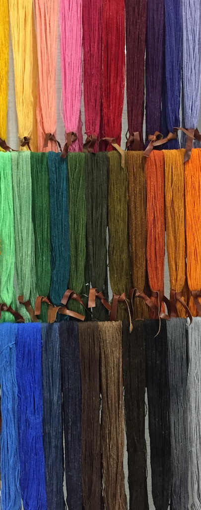
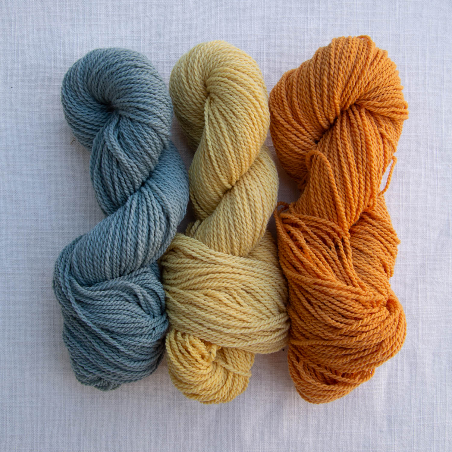
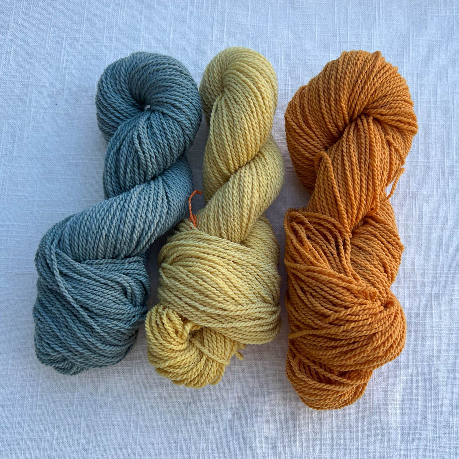
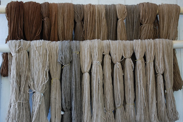 This is 5 batches of yarn out of the same dye pot. The first four skeins on the top are from the first batch. The next four are from the second and I crammed the tablecloth in that pot too. The rest of that row is from the third batch using the same dye. It looked like there was still plenty of dye in the pot so I did two more batches that are on the bottom row. They are lighter but still colored.
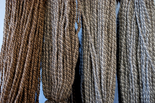
 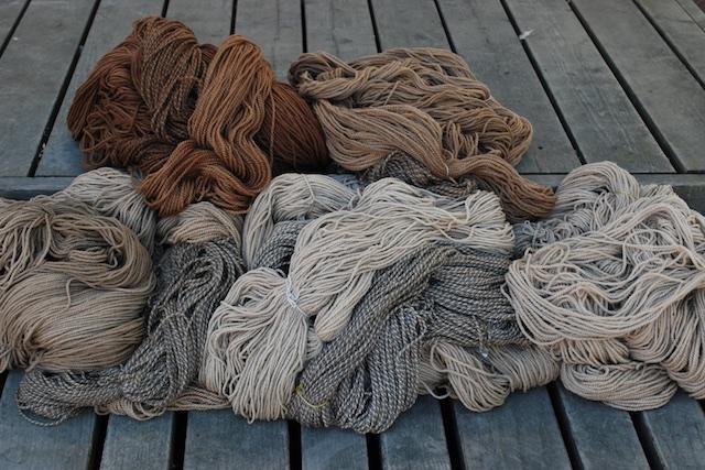 Here is another view. It is interesting (at least to me) that the fifth batch appears to have slightly more color than the fourth. It is a different yarn. The first four batches included
 I was photographing the skeins outside and out of the corner of my eye I kept seeing this other brilliant color.
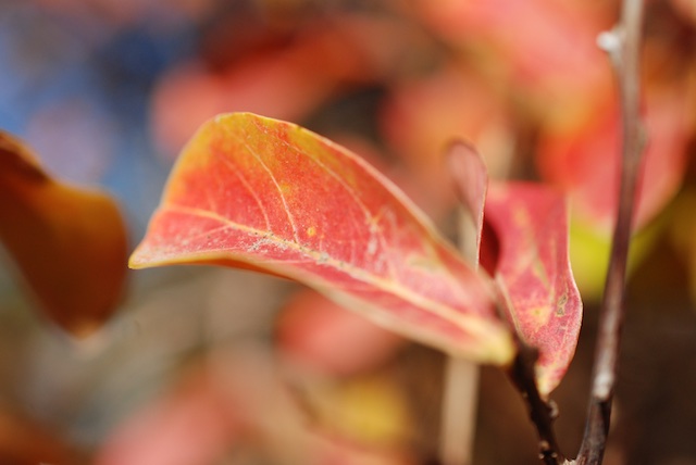

 Another great way to waste time when using technology! But it’s better for you than drugs. The iPad app is called Kaleio and the iPhone one is Teleidoscope.